Hi everyone! -waves nervously-
First post!
I just wanted to share the tweaks/customisations I’ve been mucking around with on Stylus for lemmy. :)
I’m not a professional and haven’t properly studied CSS in great detail - only through limited online research, help from developers at work and some osmosis from my job as well. As such, my actual CSS ‘code’, such as it is, is probably a horrifying mess.
However, I’m a very visual person who loves a pretty website and tweaking and customising things and I just can’t help myself sometimes!
It’s been a really good learning exercise for me to try and theme the site, taking into account all the different classes and variations there are. I would need to do a whole lot more work on this to make it viable for anyone other than me (and take into account responsiveness, accessibility etc).
Anyhoo, I kept saying to myself I should try and get over my fear and engage more with the community here so… here we go! I hope you like it as a hopefully vaguely presentable draft :)
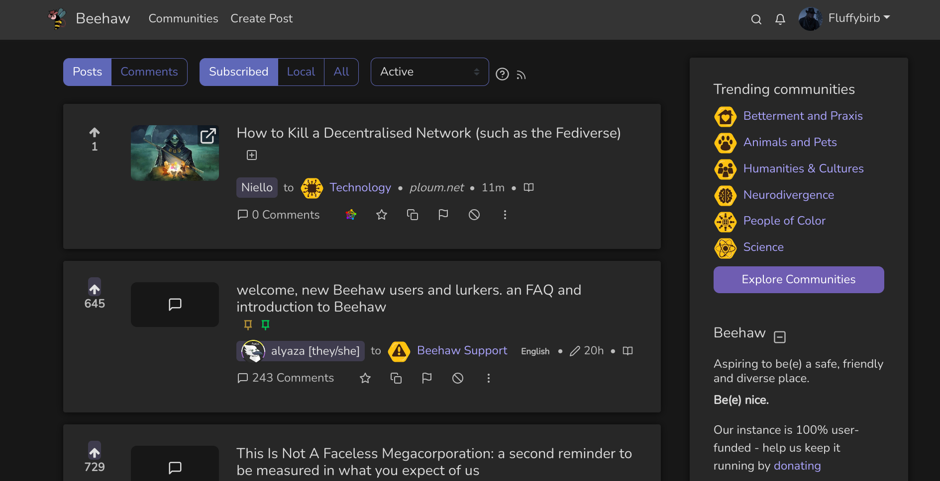
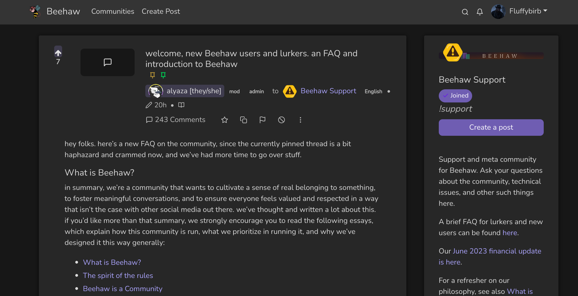
Looks very clean ^^
Thank you! _
This looks great so far, great job (as far as I can tell:D) I am in the process of learning CSS myself. Using Stylus for existing websites seems like a good way to get some practice. Is it pure CSS or do you need some stylus-specific language too?
So far to me it seems to be pure CSS, thankfully! :)
Looks good, but where’s the source?
I’m asking for a friend…
I’m sorry for being really stupid here, but when you say the source, do you mean the CSS? 😅
yes
Ah I see! I’d rather not share the CSS anywhere publicy (certainly not yet) because it’s just too embarrassing! 😂
😐
I’m sorry (and apologies for struggling to interpret your comments, I’m AuDHD and find it hard to read between the lines). When it’s cleaned up I’ll be more than willing to share it, but right now it’s probably got loads of mistakes and issues because I still have a lot more learning to do :)
I just wanted to share where I’ve got to with beehaw and see if people like it; I didn’t mean to upset anyone!
All good. I just thought it looked cool and wanted to adopt it, perchance.
I just made a blue theme (before) for Kbin that anyone can use.
To use it -
- Make sure you have the dark theme selected on KBIN first (Optionally, click here to enable the dark theme on Kbin)
- Install the chrome/brave extension called ‘User JavaScript and CSS’. There are other extensions in different browsers that do the same thing, just search for custom CSS you’ll see similar extensions that do the same thing.
- Add a new site (kbin.social) in the extension settings, and apply this CSS code.
Imgur Album with both images for comparison …
It does more than just change the colors as you can see. The layout is a little more collapsed down like old reddit. A lot of people like myself prefer that style of layout.
If it doesn’t appear to enable, just reload kbin after you enable it.
