- cross-posted to:
- lemmyapps@lemmy.world
- cross-posted to:
- lemmyapps@lemmy.world
Hey everyone! We have been blown away by the response to Liftoff and we really appreciate the support of the community. We’re passionate about creating an app that we want to use and we’re excited with the progress. There have been a ton of updates and bugfixes this week and we wanted to share the latest state of things
v0.9.18 Release
iOS:
Android:
- GitHub
- Play Store
- F-Droid is coming
- If you want to stay up to date with the latest releases before it gets on Play Store or F-Droid, checkout Obtainium
Changelog
- Fixed issue where “Everything -> Subscribed” feed showed no posts
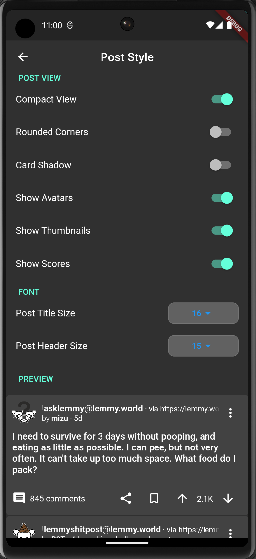
- Added better compact view
- Added Post Customization page in settings with live preview
- Added ability to customize font size
- Added ability to quickly toggle between card and compact view
- Fixed mark as read not working, added mark all as read
- Fixed issue with comment share link not being generated properly
- Added Gesture Navigation (Thanks shocklateboy92!)
- Added TOTP Login support (Thanks swmarks!)
- Added animation configuration (Thanks johnc86!)
Known Issues (In progress)
There are a few bugs still that we’re working through and we really appreciate all the support from the community helping us Beta test. Here are some of the known issues we’re working on:
- User and community link opening within the app is finicky #107
- Separate default comment sort from default post sort
- New sort in community page’s posts sometimes not working properly
- Unclear usage of everything feed causing seemingly duplicated posts across the difference instances.
- Check here for a full list
Screenshots

Y’all are doing really great work, and so goddamned quickly too. Jerboa won’t even let me log in, much less navigate this easily.
I can easily see this becoming my new time sink once Boost dies in two days! Loving the app so far, very very impressive for such an early version. One thing I’d love to see (correct me if this is already possible) is having the refresh not only available at the top of the page. Having to scroll up for half a minute just to refresh is a bit tedious :D
Yes this is coming!
Much appreciated :)
I didn’t see it on your list, but communities I have blocked are showing up on the frontpage when I have “all” selected.
Love the app! One issue I’m having that is keeping me hopping back and forth between apps is download links don’t work for me in the integrated browser. Could you possibly add the option to open in external browser?
Yes that PR is open and this functionality will be in the next release
Amazing app, are there plans to change the accent color from teal to something else? Also any chance we can get material you themes in the future?
Yes this is planned
Can you do something about the size of the reply graphics? I’m talking about the green, orange, etc line that appears next to a comment when it is a reply. They’re so narrow and the green one starts at the edge of the screen, making it almost invisible.

Edit: fixed a typo and instead of making the edit, it reposted my comment? Both versions were showing at the same time. Deleted the original. If this edit causes it to repost again, I’ll just leave it so you can see.
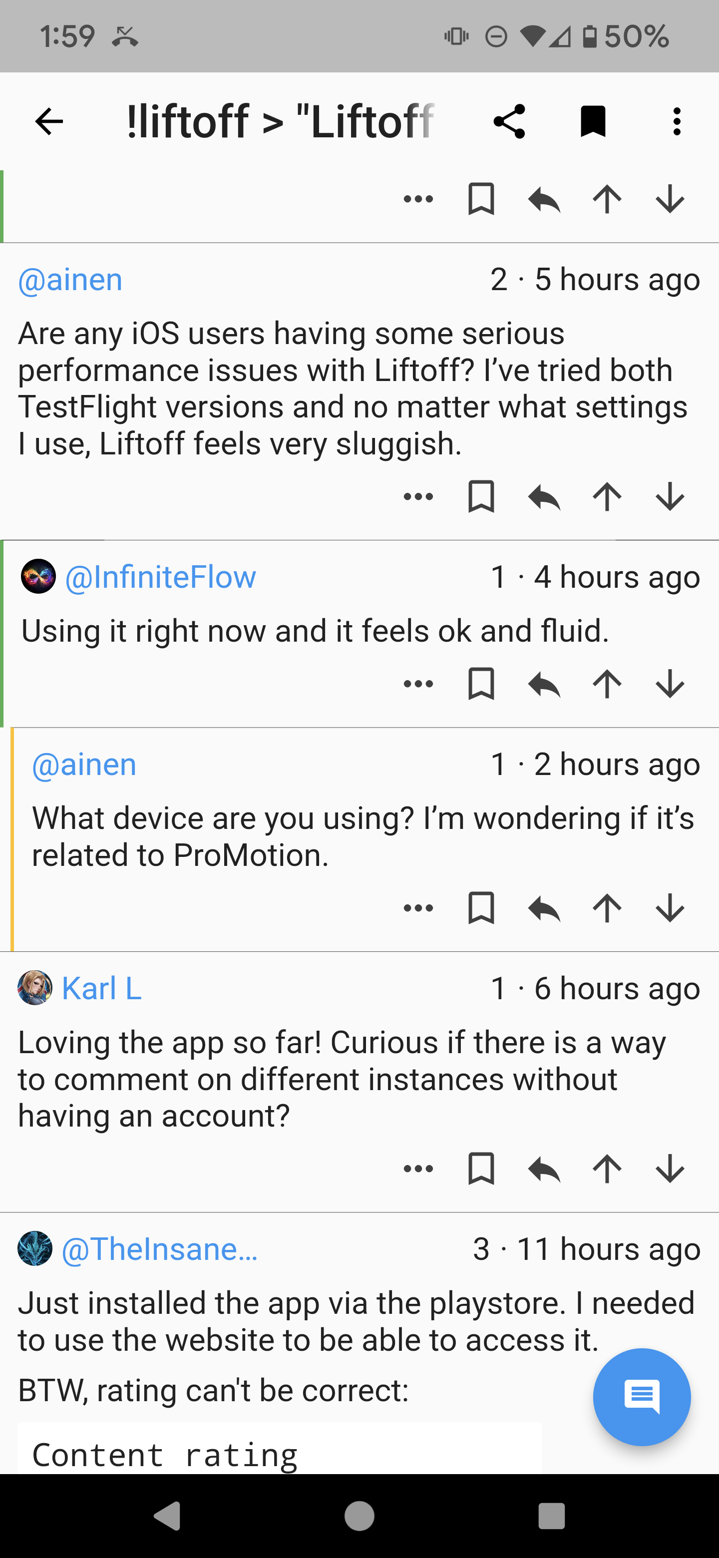
Are any iOS users having some serious performance issues with Liftoff? I’ve tried both TestFlight versions and no matter what settings I use, Liftoff feels very sluggish.
Using it right now and it feels ok and fluid.
What device are you using? I’m wondering if it’s related to ProMotion.
Any plans to add comment collapsing? Sorry, I’m new to the app, play store installed
Edit: jk, figured it out. Press and hold
Tap to collapse will be in the next release
Cool app, just got it for Android. I’m having issues adding an instance though: !lemmy.eco.br
Coming from Apollo (RIP and o7,) I love this app so far!
Comment test
deleted by creator
Your app is awesome, many thanks. I’m missing only the possibility to change the main color, otherwise it has aöready everything I need.
Hiya, thanks for the app, my favourite so far! One QOL I’d like to suggest is a left-handed card view, where the image or content is displayed on the left side of the card instead of the right. So my fellow left-handed friends can navigate a lil’ easier. Thanks!


