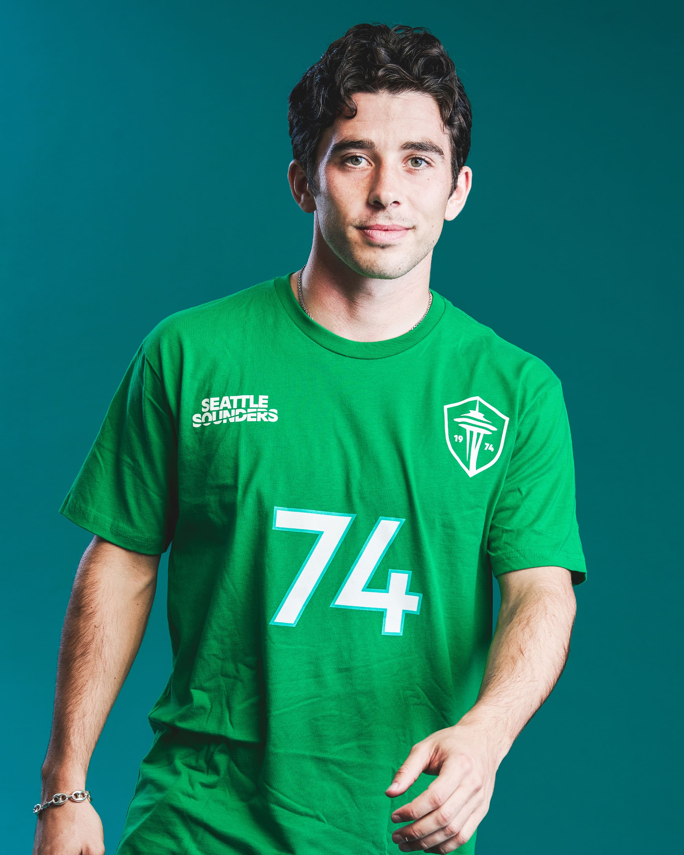
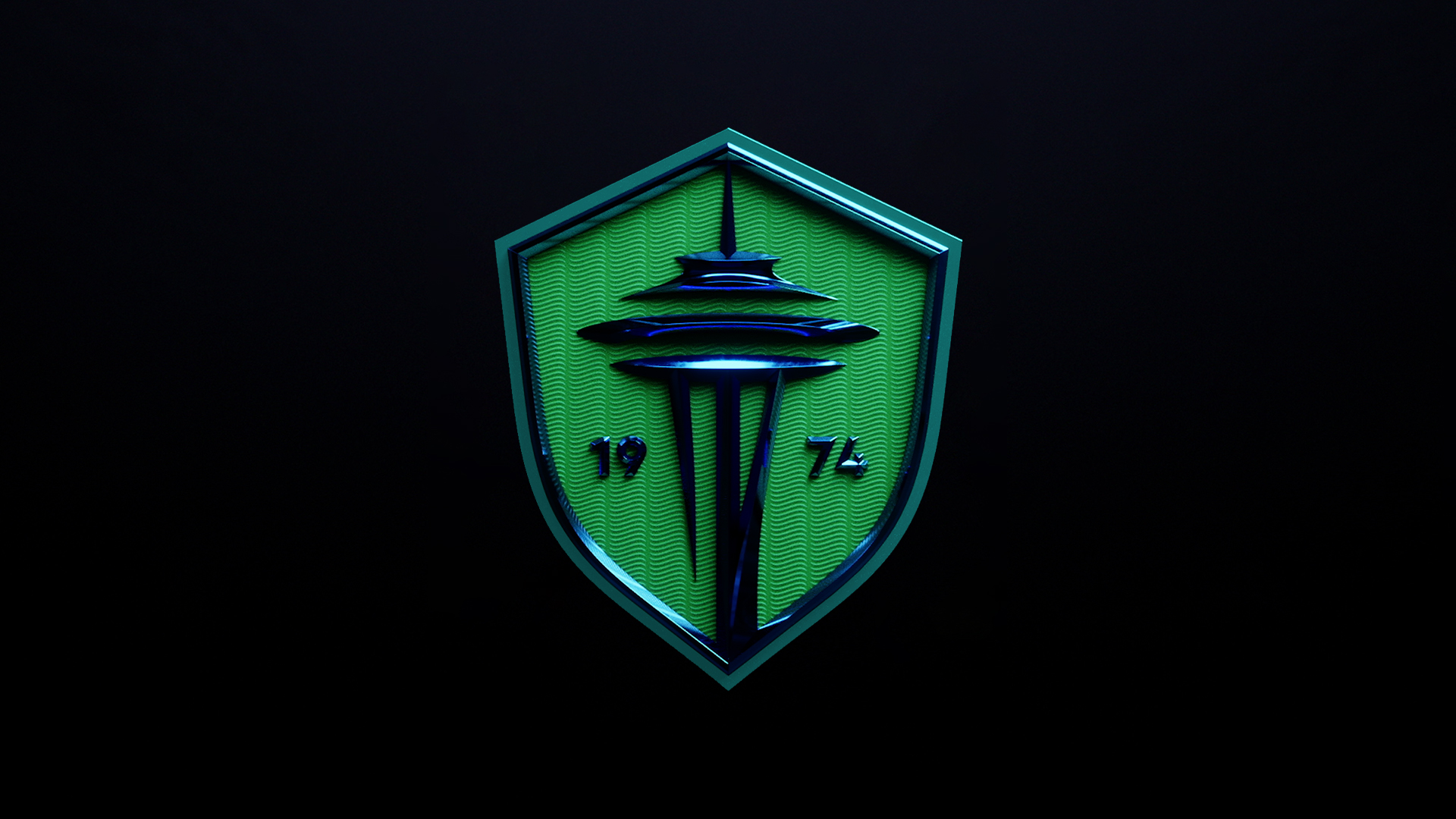
I think everything looks really great. The crest is much improved, I dig the carnation, and the orca is a fun return. Excited to pick up some new gear.
Also love that they had players and families model the new gear: https://www.soundersfc.com/eternally-yours/retail-gallery.
It does make me wonder if they signed Paul Rothrock primarily to be a model 😂

Totally agree. The crest is miles better - looks much more modern. I really like the way that they managed to refresh without losing continuity. The Carnation and Orca are also great - can see picking up Carnation gear for myself and Orca stuff for the kid. The refreshed typography and wavemark in the text also feels fresh but a good throwback. All in all, a win, IMO.
I think the design is clean and fresh. Lots of sand in panties about it on tether social media…good drama. I love the way the team incorporates the community (not just hand it off to Nike for a redesign, for example)
I love it, can’t wait to get a new jersey


