EDIT: Possibly it’s not exactly “live” and has a lag time of a few hours, at least going by the time written in the bottom left. Then the data is likely closer to correct.
It’s a few hours behind and they have obviously problems with behind the meter production. Adfitionally, the values for CO2 emisdions are off (i.e. nuclear is calculated with 5g/kWh, this is 1/3 to 1/10 of the values you find in literature) But all in all, you can see the trends of production and im- export.
Makes sense as Australia has the highest rooftop solar uptake in the world, and Queensland, the state I looked at, has IIRC the highest uptake within Australia. But agreed, it’s good to see global data even if it’s currently imperfect.
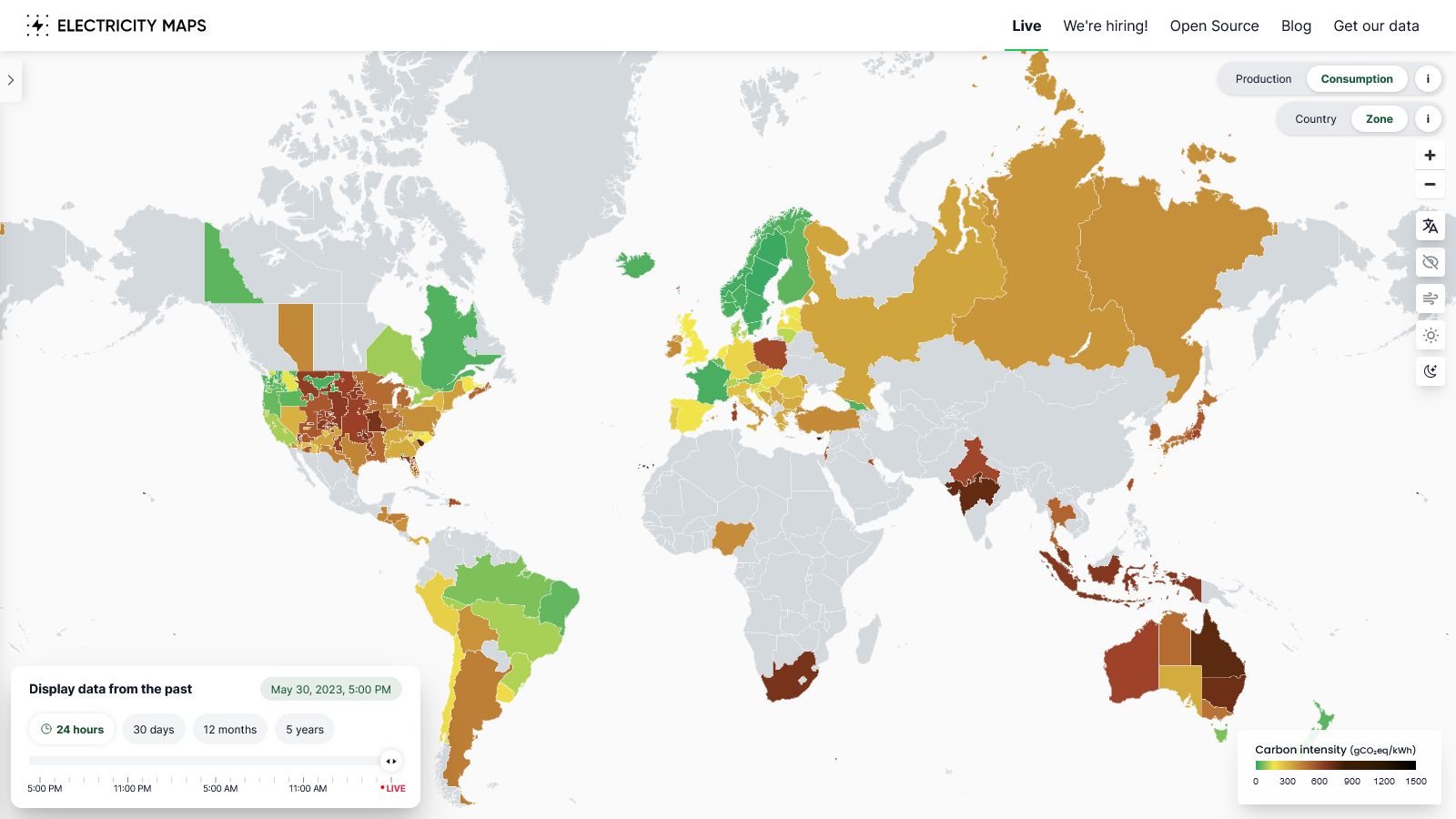
Same here. https://www.nem-watch.info/widgets/reneweconomy/ for Australia conflicts significantly in terms of fuel mix with the electricitymaps data.
EDIT: Possibly it’s not exactly “live” and has a lag time of a few hours, at least going by the time written in the bottom left. Then the data is likely closer to correct.
It’s a few hours behind and they have obviously problems with behind the meter production. Adfitionally, the values for CO2 emisdions are off (i.e. nuclear is calculated with 5g/kWh, this is 1/3 to 1/10 of the values you find in literature) But all in all, you can see the trends of production and im- export.
Makes sense as Australia has the highest rooftop solar uptake in the world, and Queensland, the state I looked at, has IIRC the highest uptake within Australia. But agreed, it’s good to see global data even if it’s currently imperfect.