People are getting fed up with all the useless tech in their cars — For the first time in 28 years of JD Power’s car owner survey, there is a consecutive year-over-year decline in satisfaction, wit…::People are dissatisfied with the technology in their cars, according to a new survey from JD Power. They especially don’t like the native infotainment systems.


I wish my car’s interface was more minimal.
I don’t mean removing knobs, knobs are good. Hiding things in 5 level deep touchscreen menus is not minimal.
I mean… removing visual noise. Removing unnecessary lights. Streamlining controls. Taking away indicators that aren’t important.
My dashboard dials are now a screen, why can’t I have an option just to display the speed and nothing else? Why do I need to see 4 dials, two driving modes, and some other crap all the time?
There’s a separate screen for the satnav, why does it need to have permanent menus displayed on it? Or visible buttons? Road names? Status indicators for various settings? I want an oled with a black pixels-off background, roads in gray, and my route in white. Nothing else. Not using the satnav, turn the screen off.
Why do I need a perpetually scrolling display showing the name of the current song? Like sure I want an interface to choose music, but I don’t need to see it all the damn time.
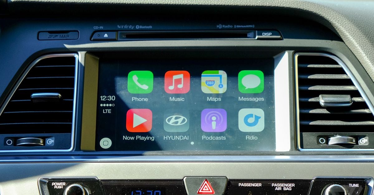
CarPlay is better than most native infotainment systems but it’s far from perfect in this regard.