
- cross-posted to:
- musictheory@lemmy.world
- cross-posted to:
- musictheory@lemmy.world
Hey.
Maybe you will like it.
I apologize for reposting it from another service; my account there had been limited for some time after registration, resulting, i believe, in my post not reaching people who had subscribed to its tags; and i suppose it is not wrong to want to reach some people once one has decided to post something in the first place. Anyway, sorry about that.
Thank you.
Edit: updated url.
Haha, fair.
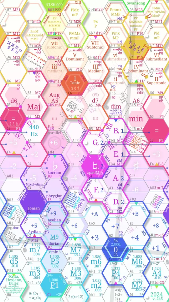
But in my defence, i had limited real estate to work with. In a Tumblr note, i explain that it was meant simultaneously as an overlay for a playable phone keyboard app that i have.
Just follow the colors, it’s the most important thing. Also capital letters, things’ initials, underlines, and sides of hexagons on which things are, all matter. And there are two colored bullets, violet and orange, which are ‘secondary’ reference points for some things, even though those things belong, topically, to areas elsewhere in the chart.
Also pay attention to whether things are on ‘depressed’ or ‘elevated’ areas (minor and major) areas, via the shadow. Eg. many transparent, minor, ununderlined, things fall on ‘depressed’.
Also, i’ll grant you that i put in an easter egg or two (not affecting the chart’s meaning, only some of its form). Eg. hexadecimal digits. But they’re an exception.
Edit: it’s really rather meant to be, if anything, a companion to reading a textbook or something, the way i learned as i was making it over a couple of weeks.
record a video of you jamming on it and explaining it. there’s nothing intuitive here.
Looked around to see what could be least clear.
Marked that the faint pink boundary in the center is the minor scale / aeolian mode (i believe), as opposed to the main thick boundary, of the ionian mode.
Changed the violet vertical bars along the right edge of G4 and left edge of F4, standing for that excepting for the locrian and lydian modes, all modes contain the main P5 and P4 intervals. Fair, they may have suggested an absence, evoking a dash. Replaced them with
fivesix (filled) bullets, representing thefivesix modes.(I may yet change the execution of those.)
As for the large blue boundary, it is just to help me visualize that all simple intervals form a quadrangle.
its possible that this is a brilliant breakthrough somehow, but it looks to me like a chemist is trying to invent a musical periodic table.
walk us through it, how would we play it?
I see this comment has been upvoted.
Really, it is just a keyboard with an extra dimension. (The ‘circle of sevenths’ follows, on the chart diagonally through the whole, the pattern of b&w keys on a standard keyboard; i marked it with the small raised b&w bullets.)
The keyboard app i made it for – the newest fork / release of it, at least – supports chords, as well as playing triads with a single tap, if you tap a vertex within a configurable distance.
The rest is just, well, knowing the stuff you want to play. (I made the chart so that it helps me with this part.) The intervals and degrees are marked.
Here are the links to the libre apps’ binaries:
https://github.com/lrq3000/hexiano/releases/tag/v1.0.2
https://apkpure.com/designoverlay/com.ms_square.android.design.overlay/download (Github page has no releases; can’t vouch for this site, disabled internet permission for this download myself)
Edit: i suppose my point is, it is literally not any harder than the regular keyboard to play. Because the ‘circle of sevenths’ and ‘the circle of seconds’
literallyare the standard keyboard in the first place.Even if my markings were all confusing, which would be fair to say, they would still at most result in a standard keyboard with, well, an added piece of graffiti on top of it. You can just ignore them.
Left/right is semitones, up/down is fifths.
Edit: i got confused there for a second. My words weren’t wrong, as such, and the chart is correct; the diagonal line indeed represents the standard keyboard layout. But for a moment, here in the thread, i thought / replied as if it were a direct one, eg. in steps of semitones. Of course it is not so; that line is in steps of sevenths, which i briefly forgot of.
But still, my point stands that the underlying keyboard is very simple. It just goes left to right, then wraps around bottom to top, intuitively. On the very bottom and the very top of it, you can see black boundaries of the standard 88 key piano range.
As i said in a Tumblr note, this is really a companion pic for a pair of (libre) apps called ‘Hexiano’ and ‘DesignOverlay’.
https://github.com/lrq3000/hexiano
https://github.com/Manabu-GT/DesignOverlay-Android
Hahah. Well, incidentally, i did just a few weeks ago come across a thing called ‘Adomah periodic table’ and downloaded it.
Also, believe me, i made it because i struggle with music, hard. I don’t know what a music key is. Despite spending many days on this chart, i still can hardly remember which direction which intervals go, especially ‘backwards’, ‘left’.
I can’t read the musical staff. I abhor that it doesn’t consistently map distances to pitch differences. I can’t memorize conventional chord names.
I made it because, well, with visualization everything is easier. (The ‘tonnetze’ are an old invention, though should be more known.)
So i, well, tried to visualize as much as i could.
But fair, here is some info (though do you think if i were good with words, i’d make a visual chart?).
An octave is divided into twelve semitones, right. So octaves are the filled tiles.
And the important thing is, this is a ‘slope’. Like a piece of paper held at an angle. As you can see, going right, it only takes three steps (of four) to get to 12 / octave, but four of three to the left. A ‘visual perspective’ thing. (Thence also the lean of the cross.)
So, on the bottom, you have the intervals. And this is an ‘isomorphic keyboard’, meaning every musical entity corresponds, unlike on the regular keyboard, to the very same hand motion (important for my poor memory; i once read piano players memorize far more motions than they could have).
Also, it is a torus, meaning, notes wrap around. Thence the equality sign on both red tonics. It’s the same pitch.
The pink stripe is an infinite (really) octave. On this chart, beyond the screen, every note occurs an infinity of times. This also means there’s infinity of gestures to play any interval. Eg. you can play the P4 by going upright-right, but also up-left-left.
What else… chords are simultaneous presses of tiles, of course.
My terms for (musically relevant) color groups are, in octave order: intervals, semitones, scales / modes, the octave, chords, scale degrees, and ‘patterns’ (mapped at intervals from the yellow tonic are patterns of qualities (major, minor, … ) you go through going by those intervals till you meet an octave).
The left colored column is the circle of fifths.
That’s an intro.
Edit: the ‘raised’ ‘islands’ are the white keys of the piano, and the depressed ‘straits’ are black.
Edit: also, the thick arrows are the order of, hm. Of white keys, i imagine. But simultaneously, of course, of interval values, scale degrees, etc.
I don’t know how to play any instrument.
But there are, indeed, videos on YT about the tonnetz, the triangular / sexangular underlying grid of the chart. They would surely help, contextualize.