jordanlund@lemmy.worldM to politics @lemmy.world · 6 days agoThe Dangerous Illusion of a Presidential Third Party in 2024www.thirdway.orgexternal-linkmessage-square202fedilinkarrow-up1255arrow-down137file-text
arrow-up1218arrow-down1external-linkThe Dangerous Illusion of a Presidential Third Party in 2024www.thirdway.orgjordanlund@lemmy.worldM to politics @lemmy.world · 6 days agomessage-square202fedilinkfile-text
Really you don’t need to read more than one chart: If you vote for anyone other than Harris, you’re voting for Trump:
minus-square14th_cylonlinkfedilinkarrow-up11arrow-down3·edit-26 days agoI wouldn’t take this graphic too seriously…
minus-squareShawdow194@fedia.iolinkfedilinkarrow-up5arrow-down2·6 days ago0.5% rounded up to the nearest whole number That’s how math works
minus-square14th_cylonlinkfedilinkarrow-up2arrow-down3·6 days ago That’s how math works No, it is really not.
minus-squarebobburger@fedia.iolinkfedilinkarrow-up4arrow-down2·6 days agoWhat is 0.5 rounded up to the nearest whole number then?
minus-square14th_cylonlinkfedilinkarrow-up4arrow-down1·6 days agoWhat does it have to do with 48% presented as more than 50?
minus-squareLasherz12@lemmy.worldlinkfedilinkarrow-up3·6 days agoThey must have let people from each state make their own graph.
minus-squarejordanlund@lemmy.worldOPMlinkfedilinkarrow-up7arrow-down4·6 days agoOne exception proves the rule. :) But Florida is gonna Florida. There’s no question who they’re voting for. It everyone else we need to worry about.
minus-square14th_cylonlinkfedilinkarrow-up9arrow-down2·6 days ago One exception proves the rule. :) No, it doesn’t. Also my point is not “how Florida voted” It is that the blue part of the right graph is clearly bigger than half, yet the text description says 48%. So the whole graph set is not really worth drawing any conclusion from, because you can’t trust the data.
minus-squareBlackbeard@lemmy.worldlinkfedilinkEnglisharrow-up6arrow-down1·6 days agoWait, aren’t ALL of those colors inadvertently transposed? The reds and blues are wrong.


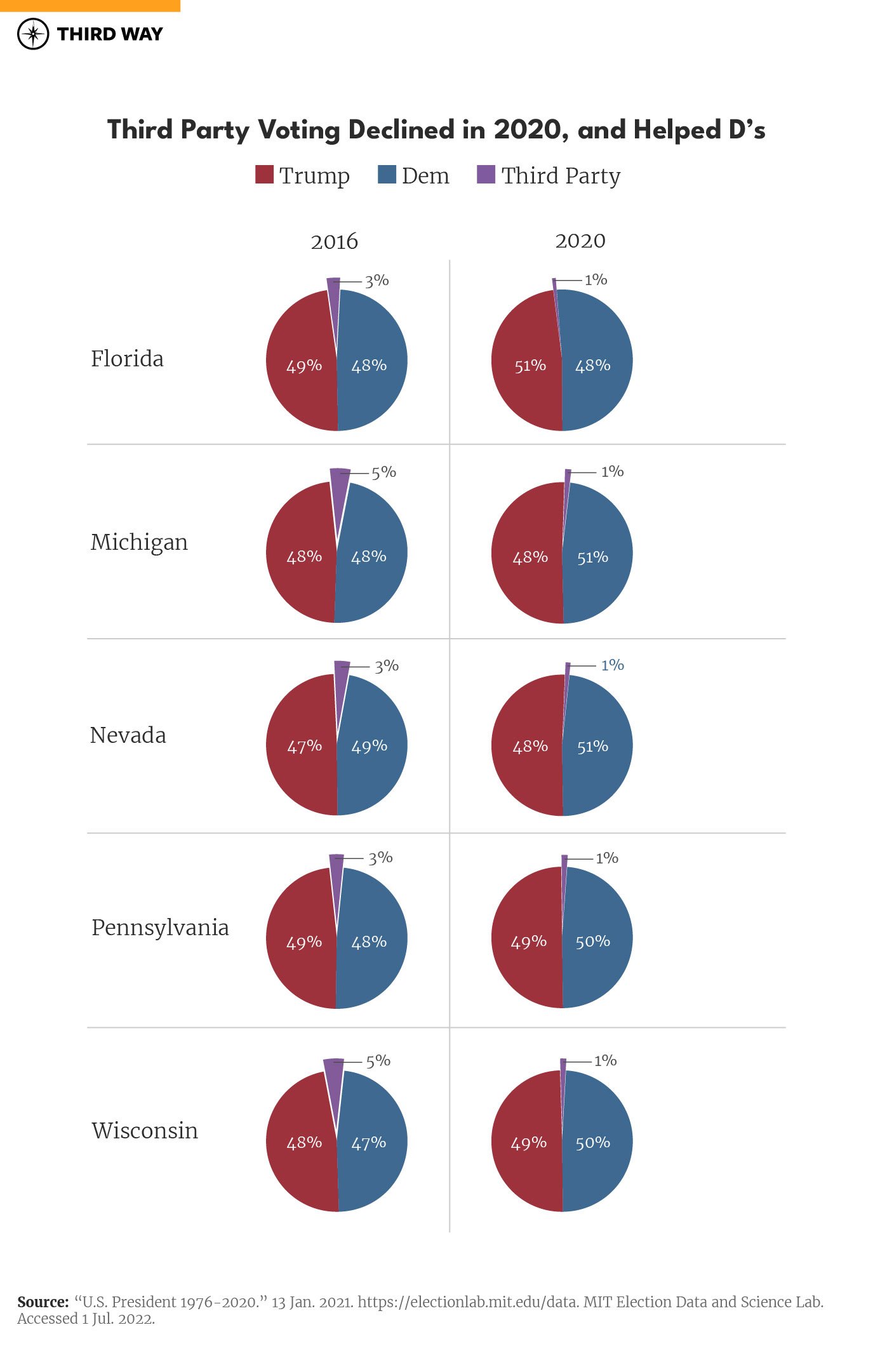
I wouldn’t take this graphic too seriously…
0.5% rounded up to the nearest whole number
That’s how math works
No, it is really not.
What is 0.5 rounded up to the nearest whole number then?
What does it have to do with 48% presented as more than 50?
They must have let people from each state make their own graph.
One exception proves the rule. :) But Florida is gonna Florida. There’s no question who they’re voting for.
It everyone else we need to worry about.
No, it doesn’t. Also my point is not “how Florida voted”
It is that the blue part of the right graph is clearly bigger than half, yet the text description says 48%.
So the whole graph set is not really worth drawing any conclusion from, because you can’t trust the data.
Wait, aren’t ALL of those colors inadvertently transposed? The reds and blues are wrong.