
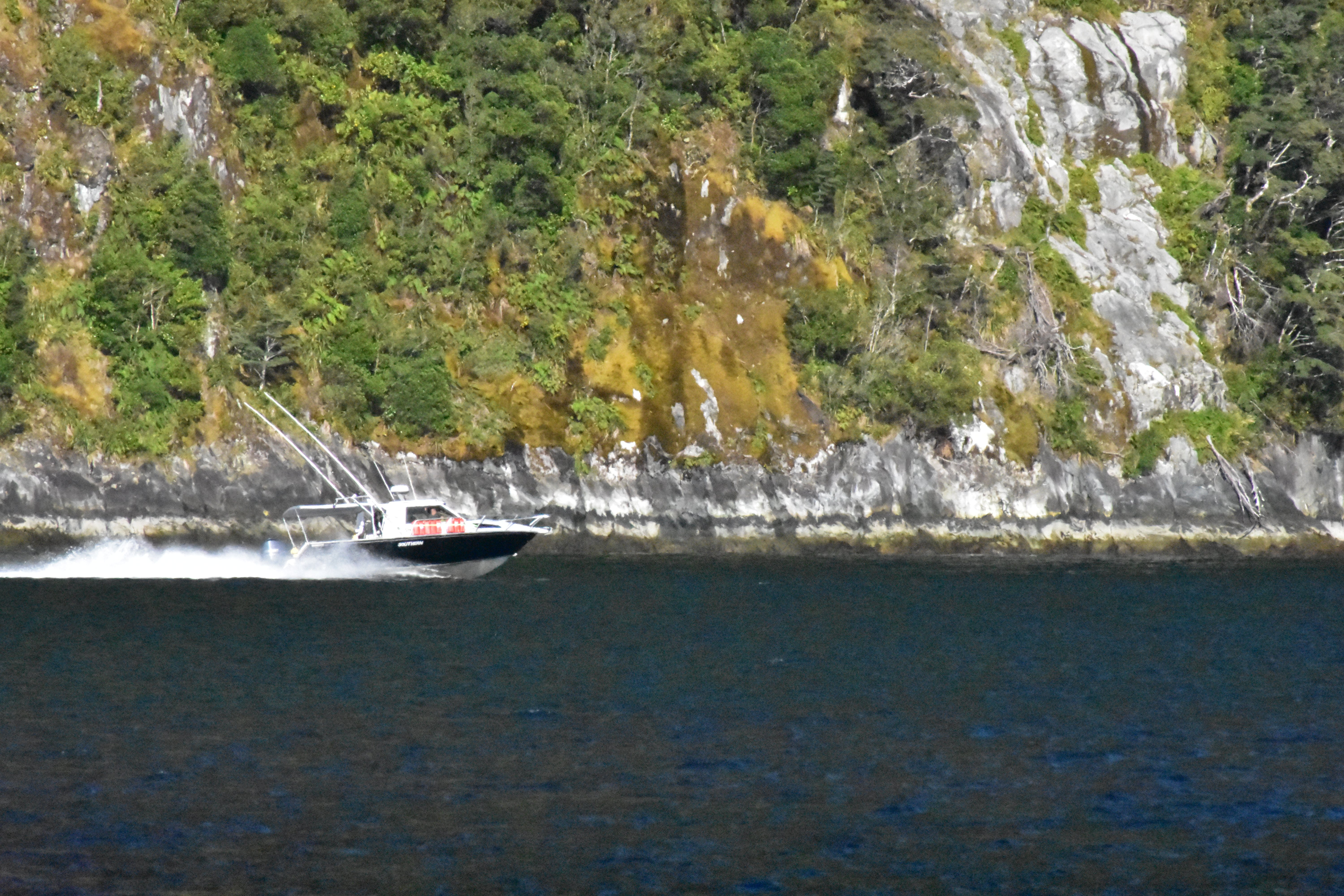
Part of me absolutely loves this picture, but part of me thinks maybe I should’ve done something differently. I’m interested to hear others thoughts.
Things I like:
- I really like the contrast between the dark water and the brightness of the cliffside.
- I also like the way the wake behind the boat appears
Things that could be improved:
-
Would it be better if the boat was on the right side of the frame? I feel like where it is right now cuts off some of the wake and detracts from the photo.
-
Also, while I like the division between light and dark, should it be framed higher so there is less of the water and more cliff? It just feels like a lot of the water is dead space to me.
Here’s my personal opinion about this picture. I believe that you selected the boat and it’s wake as your main subject for this frame. If so, in my opinion, they are too hidden in the frame. There’s nothing that makes them stand out; on the contrary, the cliffside hides it. You mentioned the contrast between the dark water and the brightness of the cliff side. I think that since both are part of the background, this big contrast actually deviates the attention from the main subject, the boat and it’s wake. Normally, placing the boat on the right side would remove a part of the story (i.e., the destination of the boat, since it is a moving object). However, since one of the things that caught your attention of this scene was the boat’s wake, I think including more of it makes sense. Then your story is not its destination anymore, but its speed, beauty, etc. Consider the stroy that you want to transmit when composing. Dead space is not a problem, the important thing is main subject and background separation (contrast), and main subject emphasis, both which could be improved in this frame.