
I’m not sure about other users, but I really enjoyed the original logo for the app being the lemming. Is it possible you could include it as an option in a future update?
I like the planet icon myself but maybe it can be a choice.
Assuming they’re not going for a particular aesthetic, style, “brand” recognition that would conflict with it.
Apparently I’m in the minority here but the lemming icon was worse.
Just tossing my opinion in the ring so that the devs know that this icon isn’t universally hated.
I agree, maybe bring back as an icon option?
the new one fits the iOS design language a bit better and from a UX/UI standpoint it’s more appealing.
I like the mouse type icon better. This one is ok but feels generic. I like the blue and the red and the white of our previous icon. Hope it becomes an option cus some people like the planet one
I don’t mind the current design. Feels more mature and hopefully it’ll appeal to a broader audience. I guess from a messaging standpoint the app services other non lemmy/mouse instances and ties more to the fediverse idea?
I can see why people like it, planets are cool, like everyone I know lives on one. Jokes aside tho I feel like the mouse was more connected. This feels very…. Meh. I’m sure in time itll get the icons base juuust right.
Dang I didn’t even consider the folks not living on planets my bad! Yea I don’t know enough about the fediverse to know what’s best. I’d say there’s validity in steering away from a reddit knockoff vibe where the mouse logo might elude to. But yea the current one can also feel bland and generic. I’m not fussed either way as long as the app is awesome which it is!
Well we have support for multiple icons so I’m sure in time we’ll have multiple styles like Apollo for whatever suits your fancy
I’m with you in thinking that the planet looks a little generic
Kinda feels like a placeholder yk
I’m sure eventually Memmy will make its own unique style like how Apollo did but then again Apollo had years of polish and I think Memmy is catching up fast given the time
As long as we have various options, I’m good with whatever. Im currently really liking the Saturn looking one in the dark gray variant.
I’ll be real, this looks really outdated and not in-line with iOS design language.
It looks like old Google Material Design stuff from 2014-ish. I’d love for an updated logo in-line with more modern iOS design language, something like Ivory or Mlem’s.
Either way I think the previous icon was more distinctive and more recognizable, whereas this one feels like an icon that was purchased in a pack, and not one for iOS apps.
Dear @gkd@lemmy.ml,
Feel free to read all this and think about it, or to disregard it all as the ramblings of a crazy man. Please realize this comes from a place of REALLY LIKING this app and certainly not from a place of malice!
I hate to be the asshole who hasn’t contributed at all and links documentation and guides to the people ACTUALLY doing work, but I’m gonna.
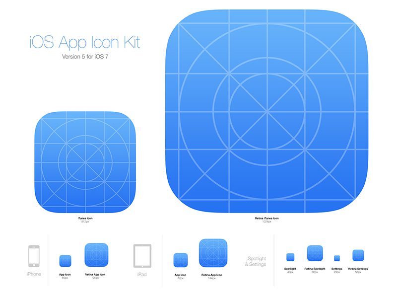
Apple’s docs do a good job showing some really basic examples and what makes a good icon, but I mostly want to bring your attention to a couple details of that safari icon they have as an example.
- SLIGHT amounts of depth, only when necessary
- A slight outward bubble/gradient
It’s also worth looking at the actual iOS icon bounding box that they show off around their developer webpages. It’s a great guide on how to design a well-weighted and well-proportioned app icon. Think about the icons of all the apps that you use daily, especially the bigger named ones. Think about the colors they use, how many colours they use, the shapes and proportions of those shapes.
Again, I know at this point I’m backseating, but these kinds of little details are really important to me haha. And apparently to others as well! You may not notice it, but your brain does
Seconded. I think the new icon is better than the previous, but not very “Apple.”
This is obviously a very low priority complaint and I’ll happily shut my mouth and deal.
Mlem’s icon is terrible though
I wouldn’t say bring back the old icon but there could be better one with more character/personality than the new one (anything to move on from clown tick lol). Personally, the new icon is fine.
Loved the red snout mouse icon 🐹
Yeah, this new icon is not good. The mouse had charm.


