Why the fuck is a page about fonts using 50% CPU?! Is it mining crypto or something?
Average website experience in 2023
That’s just modern web dev
I really hope Chrome gets its shit together and stabilizes the chrome.processes API during my lifetime so I or someone can make an extension that autokills or at least warns you about these shitty pages.
No no you see it’s the website owners that are the issue because they didn’t build the website specifically for chromium browsers /s
They’re pretty fonts and they’re released under SIL Open Font License 1.1. I dig it.
I like all of it, except for that awful “texture healing”. Imagine having words above & below like
i=mins
w=maxs
But the
m’s just slightly don’t line up because the top one is wider than the bottom one. I’d feel like my editor was gaslighting me 🤢Here’s your code example in the editor. I don’t personally think the difference between the 'm’s is super noticable. But what did strike me a lot more is the difference in height between the two 'i’s in the first line. I think that difference is pretty bad.
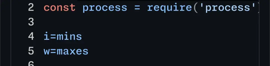
It looks like it’s not an actual height difference, but the smaller width makes the second i look significantly smaller than the first, also implying a lower height.
True, they are the exact same height. Holy optical illusion, Batman!
I suppose this is part of what makes font design so difficult.
Welp, another reason I will absolutely not be using glyph-streching or whatever Microsoft called it.
thanks for rendering that! and yeah that height difference is really weird. That almost seems like a bug.
Also Idk if the ='s make the m smaller or bigger.
If the streching is so small as to be unnoticable (and I agree it’s pretty subtle) then I also don’t really understand the benefit.
If the streching is so small as to be unnoticable (and I agree it’s pretty subtle) then I also don’t really understand the benefit.
Typically, the idea behind this sort of design is that it should be unnoticeable. The motivation is that, with other monospace fonts, the differences in character width, along with the inconsistent spacing and line thicknesses are both noticable and distracting. Some of this badness is avoidable, and this is what this font attempts.
and yeah that height difference is really weird. That almost seems like a bug.
I’ve been informed, (and had to double check because I didn’t believe it,) that the two "i"s are actually the exact same height. The first looking larger than the second is an optical illusion. Font design is hard.
Eh I don’t really buy the noticeable argument. Either it’s not noticeable both ways (doesn’t matter that m is squished all the time) or it’s not noticeable both ways (expanding m doesn’t align and it’s noticeable and annoying).
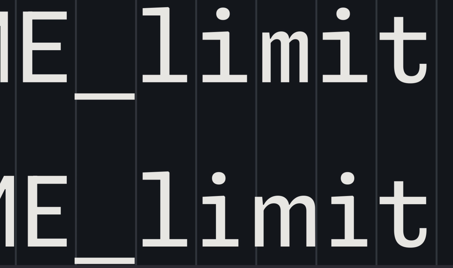
Optical Illusion
Wait no, its the fault of the stretching! I mean yes, the i’s are the same hight (which is shocking, thank you for correcting us on that) but the reason it’s an optical illusion is because the i on the left is wider and wide m exaggerates the thinness of the i on the right! Turn off the stretching and suddenly the i’s look the same height.Edit: I see someone else already pointed this out
This is what I meant by “feeling like my editor is gaslighting me”
They would still line up, wouldn’t they? Or am I misunderstanding how the texture healing would work… Would they not take the same total amount of space?
Each line is the same total length but the “m” in “mi” would be wider than the m in “ma”
That texture healing looks super nice. Is that something fonts can just do or does it require special editor support?
It’s basically a different type of ligature - it is standard to OTF fonts, but requires ligature support in your editor/terminal. Just need to enable ligatures and/or enable specific ligature sets. See https://github.com/githubnext/monaspace#editors or maybe https://wezfurlong.org/wezterm/config/font-shaping.html for the general procedure in a supporting terminal.
Is there a way to disable it but keep ligatures?
From https://github.com/githubnext/monaspace#editors :
If you want coding ligatures but do not want texture healing, you can omit the
caltsetting:Thank you!
Texture healing works by finding each pair of adjacent characters where one wants more space, and one has too much. Narrow characters are swapped for ones that cede some of their whitespace, and wider characters are swapped for ones that extend to the very edge of their box. This swapping is powered by an OpenType feature called “contextual alternates,” which is widely supported by both operating systems and browser engines.
Contextual alternates are normally used for certain scripts, like Arabic, where the shape of each glyph depends on the surrounding glyphs. And they are also used for cursive handwriting fonts where the stroke of the “pen” might have different connection points across letters. Texture healing is a novel application of this technology to code.
basically fonts were already capable of using alternate versions of characters based on their nearby characters, so they used that for these fonts to allow for seemingly-dynamic sizing/spacing
It’s an OpenType standard feature but the font rendering system has to support it and the app has to enable it. The page has a link to instructions for enabling it in VS Code but I have no idea about support status on different OS and desktop environments. I could see it working on webview on Android fwiw, I’m guessing it’s either well supported in general or at least by browsers.
Here is the comprehensive editor compatibility list for Fira Code. Should be the same.
It is well supported in all browsers and operating systems. At least VS Code and IntelliJ support it, and even some terminals.
And sadly one more font I will never be able to use due to missing support of non-latin characters.
Sadly some features are nice.
You’d think after that page of “texture healing”, alignment, etc. etc., Microsoft would actually make a fully, complete font first and foremost…
And release zip contains a _MACOSX folder which is a clear indication of sloppiness and/or rushed release. … and ligatures don’t work out the box in JetBrains product IDEs.
And if only they slapped beta on this there will be not problem what so ever…
The ligatures don’t even work in visual studio. It made me look for a different font with ligatures, landed on fira code for now. But hyphenated ligatures just seen outright broken on VS and have been for a good amount of years. Think it’s time to change IDEs soon. Might try and get VS Code to act more like it’s counterpart at some point.
Rushed, that’s just how they roll lol
Hmm nothing really jumped out at me at first glance, I don’t mind the ligature stuff, but also love monospace for the aesthetic.
But I am glad they’re experimenting with this stuff. Ive always wanted a sarcastica font, we’re almost there with sArCAsm. But it’s a pain to write :)
ZMK actually… But thanks for the idea.
Holy shit, I never even thought to do something like this. Hahaha. I’m gonna try it later.
I love the idea of using multiple font faces at the same time while looking at code. I wonder if (hope?) terminals will one day soon support switching fonts with control sequences… Would be pretty awesome!
not sure about escape sequences just yet, but Kitty gives you insane control over font rendering https://sw.kovidgoyal.net/kitty/conf/#fonts
That’s actually a really cool idea. Now I hope this too!
I still like Fira Code better. These are really nice and if there was a fast and easy way to implement fonts to my syntax highlighting maybe I’d give it more of a spin, but that seems really annoying to set up and baseline I don’t find any of these easier to read than Fira.
I used to use Fira Code, but my new personal favorite is MonoLisa
Does MonoLisa support all the proper symbols like not equal? Less than equal to? Greaten than or equal to? I love that feature when writing code. It makes it so much easier to understand imo.
Yep it fully supports those ligatures. I can’t stand when it doesn’t have those lol
Technically, font healing is a neat idea. It fails for text that does not meat its requirements, i.e. two ‘m’ next to each other. Depending on the characters around them, this might create two different ‘m’.

This is unavoidable, of course. The only solution are proportional fonts. So font healing is a nice idea. It creates a more consistent spacing at the price of less consistent glyphs. Whether one likes this compromise, is a matter of taste. I personally lean towards consistent glyphs, but I did not try it for an extended period.
I’m not sure I’d consider that “failing”. At first glance, I don’t mind the distinct “m” glyphs being juxtaposed. But perhaps I’d find it annoying after a while.
Maybe ‘failing’ is too strong. What I mean is that in situations like the one I showed, texture healing cannot solve the problem of uneven texture. Not that they claimed it does. It just eases the problem. I like to know the trade-offs. When does it provide an improvement and when not? What tensions does that create?
From a users point of view, I do not know if it ‘fails’ or not. I totally agree with you. Maybe the I would find to distinct ‘m’ glyphs annoying, maybe not. And example emphasizes the ‘problem’. Maybe, I woukd even notice while coding or writing. To know that, I need to try. I just like to know the trade-offs in advance.
When reading the announcement post, I was indeed hoping they’d include an example word with two "m"s in a row, so I was glad to see the example here. I don’t mind it, but it does feel almost dishonest to exclude that case from their post.
Yeah, I am always happy if a project not only mentions where it shines but also where it does not. But it is common practice not to do so. Same in academic publishing. Everybody is focused on selling oneself, it seems.
I’ve long preferred proportional fonts and positional tab stops like what you find in a WYSIWYG word processor. Got a tab position wrong? Drag it as appropriate or, if necessary, add a new one. In fact, during a period where I was doing far more writing than programming, in the days before code completion, I preferred my WYSIWYG word processor to my code editor. I had appropriate scripts and macros for cleaning up imported text files and to always save both native format and a text file with spaces in place of tabs. I also had different templates for different languages so that I could have custom processing for different languages. (It helps that a big part of that job was teaching people how to use word processors as far more than just electronic typewriters.)
Now, of course, the programmer’s editor is an advanced tool tailored to the job, making it lunacy to even consider a word processor as code editor. Which doesn’t mean that there aren’t word processing concepts that might be valuable.
Nick Gravgaard has some good writing on the subject and links to a variety of resources, including to at least one proportional font designed for programming.
Interesting. Thanks for sharing. I started with WYSIWYG and did not like editing with proportional fonts. Things do not align, the cursor jumps around and movements have variable distances. But I much prefer looking at beautifully typesetted proportional font (e.g. with LaTeX). While I think, monospaced font are nice for editing, they are okayish to look at.
Thanks for the link. I will look into it and maybe try proportional for coding once more. Another idea I really like are almost proportional fonts. Read about these fonts a few month ago. So far I haven’t tried them.
I’m just getting back into programming as a retirement hobby after leaving the field due to burnout 15 years ago. That means I’m only just starting to figure out editors and such.
I don’t know of any code editors that use tab stops the way a word processor does. A word processor uses tab stops specifically for alignment at defined positions rather than tab characters equivalent to specific number of spaces (or tab key to insert specific number of spaces). Without the ability to set positional tab stops, I don’t know that proportional fonts will be all that great for most people.
I took a look at your link to almost proportional fonts. Thanks. I don’t know how I missed that, given that iA Writer is one of the editors I’ve been playing with for general purpose writing. (I’ve become disillusioned with the state of modern word processors.)
Neon and Argon: Seem okay. They’re really quite similar though. It’s like the designers couldn’t decide which they liked more and so just decided to release both.
Xenon: It feels alright. The horizontal serifs give everything a more uniform look, but you can also get that with any other serif font.
Radon: Uh, no thanks. It’s like someone took the weird letters from Dank Mono and said “what if we did that but for the whole font?”
Krypton: What if we just took OCR A and added ligatures? Alternatively, “Floating Point Precision Error: The Font”
Overall, none of these are compelling enough to make me want to try them. I quite like the Texture Healing feature, but it’s not enough to make me want to move to it.
Also, using multiple different fonts in one code file sounds horrendous.
Radon, the “handwriting” one, seems like if someone wanted to have Comic Sans but for code.
Comic Code is a thing and it’s 10/10. It’s proof that handwriting style fonts for code is possible.
That’s exactly how I thought, I’m not a dev myself but are there really people who might use a font like this to code?
It’s a stretch, but the only thing I can think of is that it might be a bit better for dyslexic people because the letters are a bit more diverse, but I don’t think it’s nearly enough to be considered an actual dyslexia font.
Some might. I using Comic Code and Fantasque Code from time to time as it forces my brain to reinterpret “known” code and helps to find errors that way. It also help with minor dyslexia moments. I like Radon, except I fully hate how “i” character is looking it is a “z” with a dot on it. If there were variant with normal “i” I would consider using it.
I would, just to have something different in my setup for a while. It gets boring when everything looks the same year after year.
I think Xenon with it’s small serifs looks a bit like SimSun, but with better kerning
I don’t think I’ve ever felt the urge to apply an alignment chart to monospace fonts of all things, but Xenon and Radon are basically lawful and chaotic evil respectively.
The fonts are nice but I absolutely hate the “copilot voice” text moving around idea, it’s absolutely terrible to read.
I don’t think the intention is that Copilot voice would be animated, I think they just had a dumb idea to highlight it that way in the demo. Look closely, and you’ll see the Copilot voice is the only text there written in the “Krypton” font. The animation indeed looks godawful.
I hope you’re right
Neon is the only one that I think is passable. The rest are a bit too stylized for code. The texture healing is a great idea though, I would love for that to be common.
Edit: Actually I’ve changed my mind. Texture healing would introduce too much variation in similar texts. If spacing is a problem then maybe the font is simply no good.
Yeah texture healing is poorly thought out and will break way more things than it “fixes”. If your font needs that, go in and fix the damn font. A solution to a problem no one asked for, thanks Microsoft!
Damn, these are pretty good.
I’ve been using Iosevka for quite a while now which is very tall and thin by comparison to most fonts. These are wider, but that makes them more favorably compare to Consolas, still overall my favorite font for the console (Cascadia Code looks weird with Antialiasing IMO).
Going to give Xenon in particular a week to try it out. Love a programming font with serifs.
There’s Iosevka Extended
Ooo… I like the purple one (Krypton). Very space-aged.