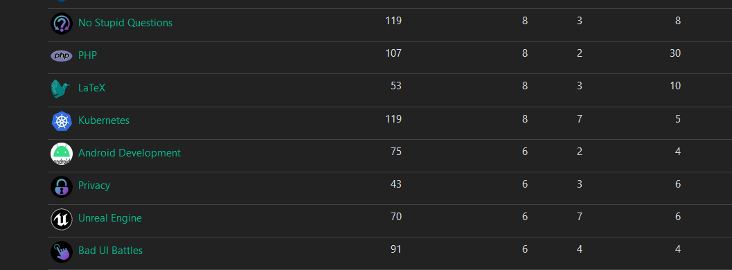
Ive been working on some unified icons for the instance so the icons feel like they belong together
Let me know if you like them or if there’s some adjustments I should make
Some examples from ones I’ve done


The majority of them are generated from https://game-icons.net/ with the settings of foreground being shrunk twice and position being x:2 y:2. Foreground color is diagonal from 2EE5D2 to A01FC5. And has a shadow with color 423025 and blur set to 15. The background color is just black


I think circles are better. While circles don’t pop out as much as cropped polygons, I think they still fit better with the general web ecosystem of avatars and profile icons. Not to mention they allow for a slightly larger canvas size for artwork already circle cropped by Lemmy-UI’s CSS .
It would be cool if Communities could be rounded squares, and reserve circles for users, just like github orgs vs github users. That could help with readability between the two when skimming icons in lemmy’s page feeds. But perhaps that should be a user customization. As long as most artworks abide by best practices for maskable icons, then different lemmy clients, web UIs, mobile app launchers, etc, could crop however they like:
The new brighter colors do help. BTW, I do love rainbows. One thing you might want to try is once you’ve settled on a good saturation and value for readability, you could diversify the hue across different icons (with perhaps the hues for the gradients derived from the original/official logos/icon’s color palette, if not too difficult to maintain), allowing local communities to be more readily distinguishable from each other at a glance, while still unified stylistically for our instance, sort of like a colorful android launcher icon pack?
Perhaps we could code up scripts to do this theming, so we could automate this procedurally? Similar to this art pipeline: