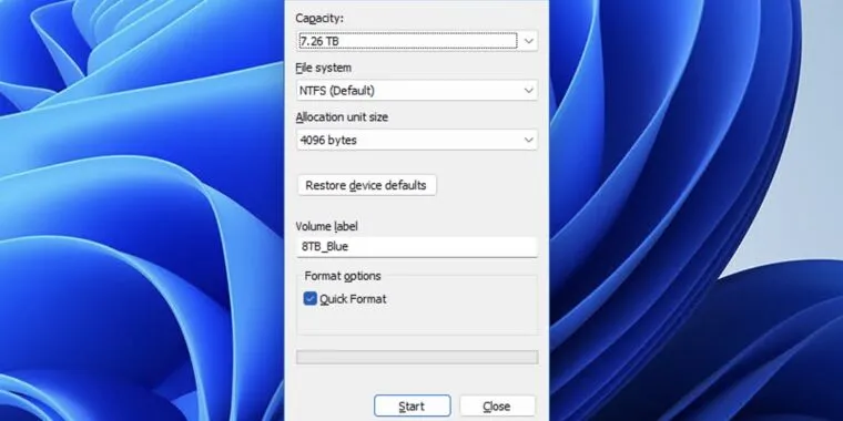
“It wasn’t elegant, but it would do until the elegant UI arrived.” It never did.
Don’t remind them, they’ll replace it with a new UI with ads and bing AI.
Always a hoot when you click through Windows 11 settings and get taken to menus from 8, 7, I think there’s still a few vista menus hidden in there.
lol, yeah I came across a pretty old dialog when manually installing my printer on windows 11 the other day. Got prompted to insert a floppy disk with the driver.
There’s settings that only exist in the older menus too. I hate the settings overhaul from 10, it turned troubleshooting into a goddamn scavenger hunt. Toggles that used to live in dialog boxes on the taskbar are suddenly behind 2 separate settings windows that both somehow always take a second to load. Just so I can click a single button, usually to open another superfluous settings window.
I swear to god microsoft is the only company simultaneously making their product worse and harder to use for both general AND power users.
Even since 10, they keep moving shit around. I’ll Google how to disable some stupid feature and then have to search through the results to figure out which one still applies.
Also, anyone else notice that in the MS support threads, almost every single first response is useless and doesn’t even really address the specific question being asked but a very basic version of it? And then 50/50 whether a better reply comes in after the OP says they already tried that (and said so in their OP) or that the response has nothing to do with what they actually asked.
For the life of me I do not understand those “windows support volunteers” on the Microsoft help forums.
Like you say they always rush to answer the wrong thing. The “most helpful” answer is usually posted by one of them and it’s just wrong. Yesterday I had to scroll through 4 pages to find the (incredibly simple) answer to a problem I was having with Word and all the volunteer responses were utterly useless and just rehashing what the OP said in their post.
Sometimes the new settings UI and the old settings UI aren’t synced and will conflict with eachother, windows 10 has at least 3 volume settings menus (the oldest is from XP) and at least 2 of them operate independantly of eachother with the actual sound output being the average of the two.
What’s a pain in the ass is when you have to try to get to those menus to do something like change an environmental variable or restart a network adapter.
Microsoft has been making it more and more difficult to efficiently administer Windows.
They actually made the environment variable editor a lot better in a recent version, at least for the path. It looks like this now: https://lemm.ee/pictrs/image/ea62bdcb-8165-4e8d-a9bd-a9d76439f76d.webp
I actually noticed that last week when setting up some repos to migrate from JavaX to Jakarta. It was a pleasant surprise.
Although getting to that menu was a pain in the ass. One of these days I’ll get around to memorizing the .msc list, but thankfully my job is fucking with RHEL
i remember many of them from the xp era
It is elegant though. Please don’t “improve” it please
Nothing is as permanent as a temporary solution
These are the only good, clean and functionally bug free pieces of code in the entire windows system probably.
There is no temporary solution in IT. Do it once and do it well.
Simultaneously, there is no perfect solution in it. Do it once, do it well, regret it later. Then do it once again
And if it’s in Windows, make sure it’s in a tiny window that you can’t resize.
There’s nothing more permanent than a good temporary fix.
Nature will not heal until the “make system disk” option makes a comeback, complete with Windows ME-ass DOS system files


