
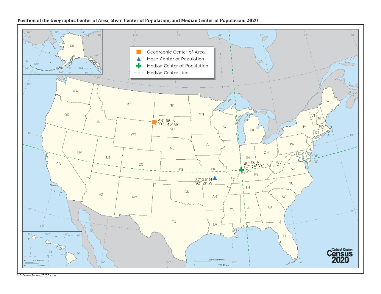
This would be interesting to see without Alaska or Hawaii skewing the centers west.
Alternatively, I would be really interested to see this done for France if it includes Tahiti 😂
I agree on both points ha ha
This is incorrect. Each HALF is 1/2 the population. So the northern half have as many people as the southern half, and the eastern half has as many people as the western half.
Wait, in that case, isn’t the 4 quarters view also correct?
Not necessarily. For example north east could have 3 people, north west 4 people, south west 3 people, and south east 4 people.
North and south each have 7 people, east and west both have 7, but the 4 quarters aren’t equal.
It’s easier for me to visualize it as posted, with an x and y axis. The presentation gets the data across without having to show it as a heat map, clusters, etc. I once tried to explain excitedly to someone that I had just learned that the center of the US as a landmass is in South Dakota. I wish I’d had this map at the time.
Fascinating. Would love to see a series of these done for other countries.
I’m surprised the north-west can claim a whole quarter like that.
There is Chicago in that quarter
Seattle, Salt Lake City and I think Denver too. I’m still surprised.
Fascinating. I had no idea I lived so close to the MEAN center of population. It makes me feel important in my town of 9,000.

