“Make it less square” isn’t really an option, since the attack it’s used for needs a square hitbox.
If you’re not committed to the palette I feel like grey could give more of a rock/stone connotation. Something like
 maybe
maybeThanks! Looking at the environment where the rock shows up, I think a more limestone-ish color would work better than what I have now. I’ll give that a try.
make it more square
Fewer and bigger/more well defined facets
I agree. I feel like the veins serve to make it busy instead of contributing to the form. If it had 2 rock climbing holds cut out of the square then you’d go “oh! it’s a rock.”
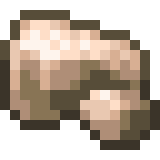
I am not an artist, but rocks tend to have somewhat sharp edges because of their crystalline structure (and in art, to emphasize their 3D-ness). You clearly understand this because I can see it in your rock. If you could shade the center so it looks like it’s sticking out a bit, it might look better/more rock-like
I’ll give it a try. Thanks!
Chunkier, more defined shapes. Imagine that it’s a warhammer figure and you need to be able to “read” its shape from far away. After you have the basic forms defined, go in and add the textures like the cracks.
Does the hitbox have to map 1:1 to the sprite? I’m no expert but I thought usually they did not
It will need to be reasonably close in this case.
I would round off the corners a bit more
Eat it
lip gloss
Shade borders?
