Sounds like you just don’t like 100% stacked column charts. This is their primary use case after all. I can’t see how an XY plot would do a better job, wouldn’t there just end up being a ton of overlap, making it hard to discern the differences between the smaller segments? Do you have an example where you think an XY plot represented this type of data better?
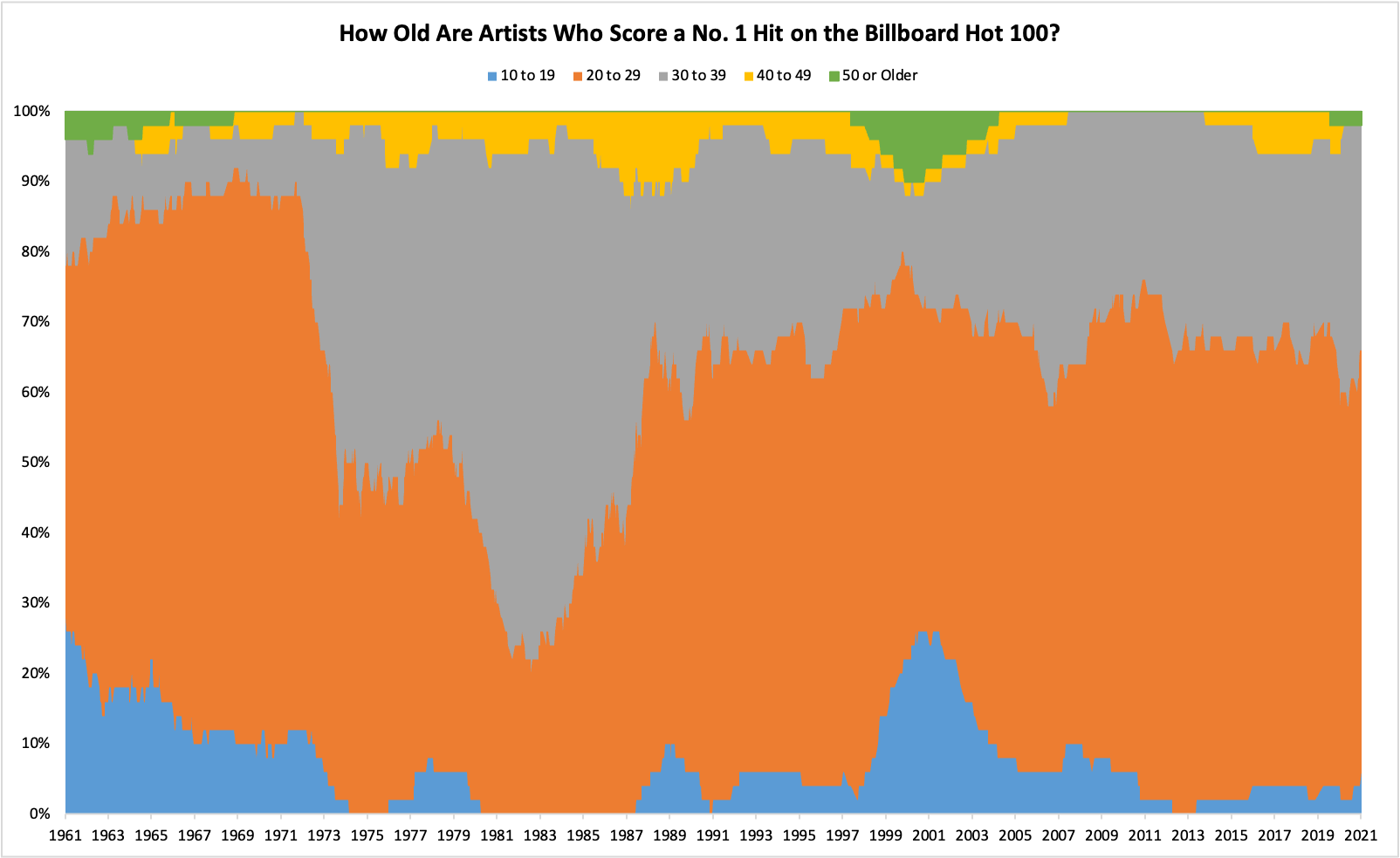
It makes it difficult to make within group comparisons due to the shifting baselines. They are fine for “gee whiz” global impression but simply not appropriate for detailed analysis. And yes, I greatly despise them.

Sounds like you just don’t like 100% stacked column charts. This is their primary use case after all. I can’t see how an XY plot would do a better job, wouldn’t there just end up being a ton of overlap, making it hard to discern the differences between the smaller segments? Do you have an example where you think an XY plot represented this type of data better?
It makes it difficult to make within group comparisons due to the shifting baselines. They are fine for “gee whiz” global impression but simply not appropriate for detailed analysis. And yes, I greatly despise them.