The starting point is just so you can adequately see trends for both plots shown and is quite sane. I also don’t know if I could call an ~5% decline and clear trend minimal either.
All starting at 0 would do is ensure that you have no way to accurately gauge the data points values. It would also just compress the data to an incomprehensible smudge of a line.
Showing the data over an entirely different timescale than what’s currently under discussion means nothing in this context to illustrate your point.
Starting from 0 on the y axis just means you need to change the scale, which like I said makes reading any data points incomprehensible, or end up with an unnecessary amount of whitespace.
If you start at 0, you see exactly what you’re supposed to: there is a rather negligible trend in the given timeframe.
That’s the point. The number of users has very slightly declined in the past few months. Under the original plot, you have a lot of people (rightly) misinterpreting the data, and saying that a lot of users are leaving the site.
That’s why you start at 0. So that people interpret the data correctly.
If you start at zero, the exact same data is shown as when there is a clearly labeled breakpoint. It contributes nothing other than obscuring the data points and scope of discussion is only for the past month. You’re not making a cogent point.
Just like I said before, a 5% decline is not an insignificant drop or “very slightly declined.” Expanding the scope of the argument to show that it’s actually a far steeper decline in user engagement and then arguing the opposite point is misinterpreting the data. Expanding the scope just shows that the trends are continuously showing declining user engagement with no organic growth other than Reddit fucking up.

The starting point is just so you can adequately see trends for both plots shown and is quite sane. I also don’t know if I could call an ~5% decline and clear trend minimal either.
If you start the plot at 0, you can distinguish between a strong trend, a weak trend and a lack of a trend. This one is terrible for gauging that.
All starting at 0 would do is ensure that you have no way to accurately gauge the data points values. It would also just compress the data to an incomprehensible smudge of a line.
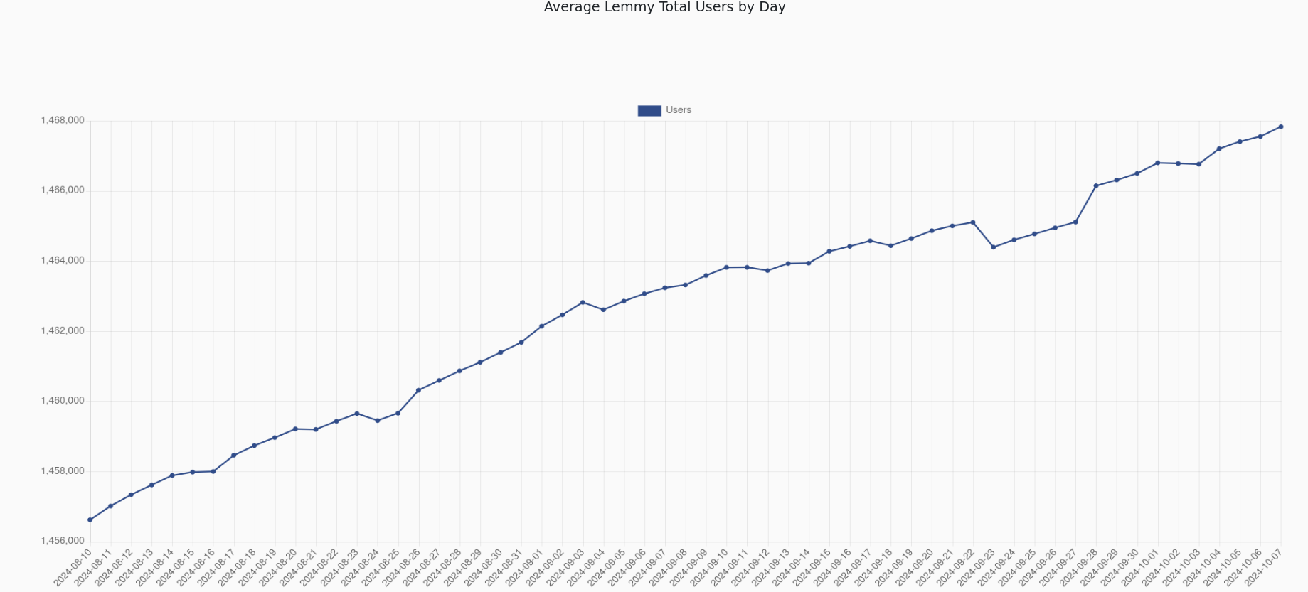
Let’s put that to a test
Showing the data over an entirely different timescale than what’s currently under discussion means nothing in this context to illustrate your point.
Starting from 0 on the y axis just means you need to change the scale, which like I said makes reading any data points incomprehensible, or end up with an unnecessary amount of whitespace.
If you start at 0, you see exactly what you’re supposed to: there is a rather negligible trend in the given timeframe.
That’s the point. The number of users has very slightly declined in the past few months. Under the original plot, you have a lot of people (rightly) misinterpreting the data, and saying that a lot of users are leaving the site.
That’s why you start at 0. So that people interpret the data correctly.
If you start at zero, the exact same data is shown as when there is a clearly labeled breakpoint. It contributes nothing other than obscuring the data points and scope of discussion is only for the past month. You’re not making a cogent point.
Just like I said before, a 5% decline is not an insignificant drop or “very slightly declined.” Expanding the scope of the argument to show that it’s actually a far steeper decline in user engagement and then arguing the opposite point is misinterpreting the data. Expanding the scope just shows that the trends are continuously showing declining user engagement with no organic growth other than Reddit fucking up.
Are you trolling or just very fucking dense
I’ve been asking myself the exact same thing.
The top level comment on this thread, to which you complained about graphical syntax, is discussing the MAU decline over the past 30 days.