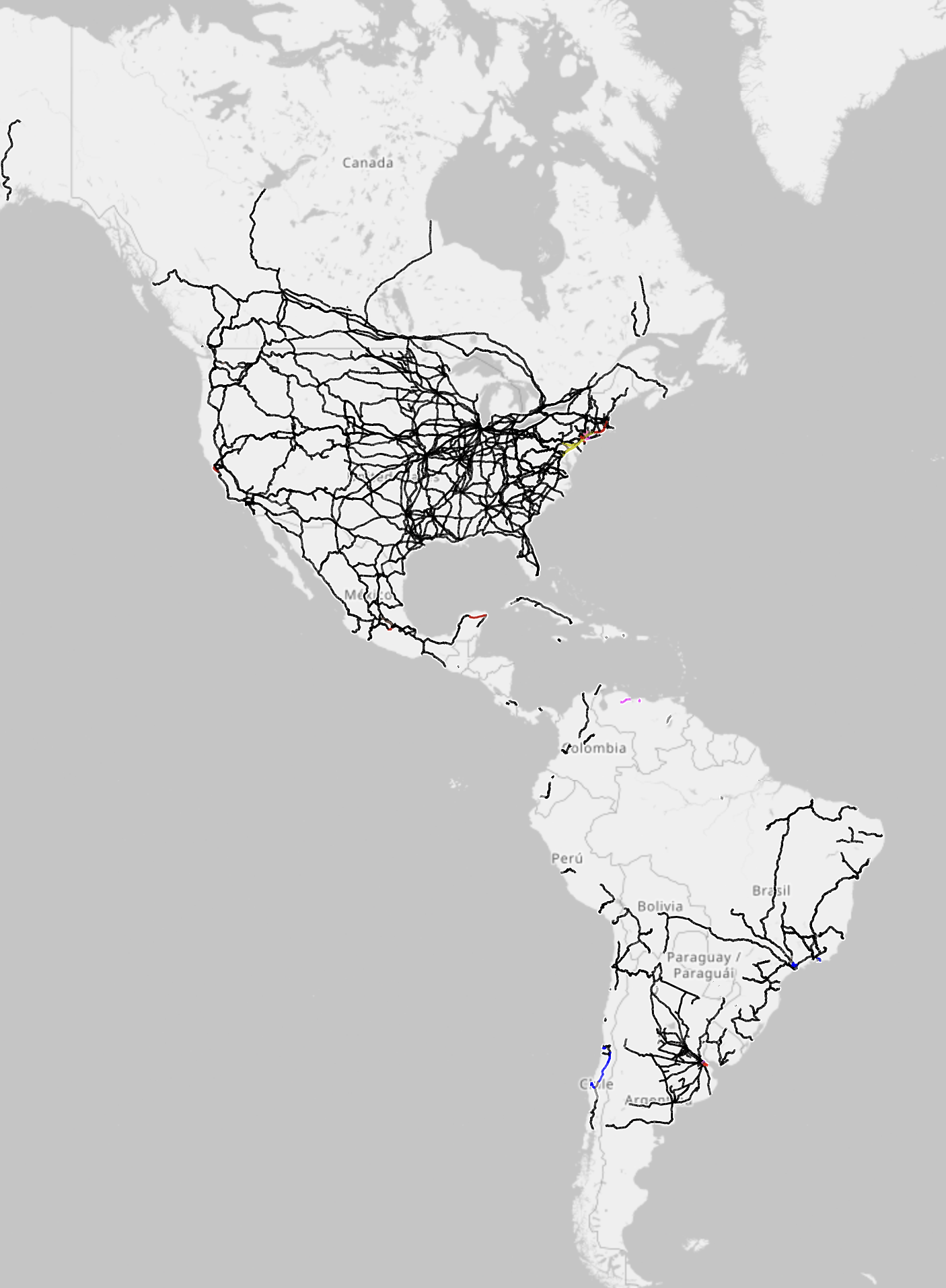
I think the original poster posted this intentionally as sarcasm because there is so little color in the image. If you look at the original image and look at the USA North east near new york, you’ll see a few meager lines that are various colors (as well as a few slivers in south and central america, and what looks like a dot in los Angeles). This is showcasing just how little electrified rail exists in the americas.
It may not seem like it, but it is actually in color. I’m on mobile and am able to see it. If you’re not able to, it may be an issue with your app or method of viewing the post.
That is correct, it isn’t the default view, it’s the electrification view, which OP inferred they were using (the title says electrification map). If you open the link, the orange is worldwide general rail infrastructure.
If you click the top right options button (the 3 line “hamburger” icon at the far top right, separate from the map layers), you’ll see an option for electrification. This is the map they shared.
The grayscale option actually only grayscales the territory, not the infrastructure. I hope this helps clarify the situation.
You should declare that then, when practically the whole map is in grayscale. Some of us have piss poor vision, I’m at 20/500 vision myself, and my pupils are starting to solidify. Plus my glasses are tinted.


Posted image is literally in grayscale (though the provided link is in color).
I think the original poster posted this intentionally as sarcasm because there is so little color in the image. If you look at the original image and look at the USA North east near new york, you’ll see a few meager lines that are various colors (as well as a few slivers in south and central america, and what looks like a dot in los Angeles). This is showcasing just how little electrified rail exists in the americas.
It may not seem like it, but it is actually in color. I’m on mobile and am able to see it. If you’re not able to, it may be an issue with your app or method of viewing the post.
If you check the link they shared, it’s practically all orange, so they did not share the default view, nor a color legend to go along with it.
That is correct, it isn’t the default view, it’s the electrification view, which OP inferred they were using (the title says electrification map). If you open the link, the orange is worldwide general rail infrastructure.
If you click the top right options button (the 3 line “hamburger” icon at the far top right, separate from the map layers), you’ll see an option for electrification. This is the map they shared.
The grayscale option actually only grayscales the territory, not the infrastructure. I hope this helps clarify the situation.
I do agree that a legend would have been helpful.
yea ofc the map is orange, it’s showing the infrastructure type instead of electrification
yk how maps work right?
Not entirely, not when the map site just kicks me back to Lemmy when I attempt to change ‘Style’
No it’s not, zoom in on the north-east of the USA.
Thank you, very helpful 👍
Because the vast majority of the rail lines in the Americas are fossil fuel powered.
I checked your provided link, practically all the lines in the USA were orange, not black.
That’s for existing rails you have to click the electrification option.
Then you should clarify that people should check the link if they want to see the colored map.
Lemmy preview doesn’t care about that, you literally shared the grayscale version and called it colored.
Zoom in closer and you see the colour. Why are you so negative?
Not being negative, just telling you what I see. Also, you didn’t provide a color code, nor did you suggest phone users to zoom in.
Yay, I get more criticisms.
That’s why I said colour in the title and phone users already know they must zoom in on map data.
Dont take that personal, I enjoyed your post and its really not your fault ppl cant even read map descriptions.
Thx for posting <3
You should declare that then, when practically the whole map is in grayscale. Some of us have piss poor vision, I’m at 20/500 vision myself, and my pupils are starting to solidify. Plus my glasses are tinted.
Also, why no actual color guide?