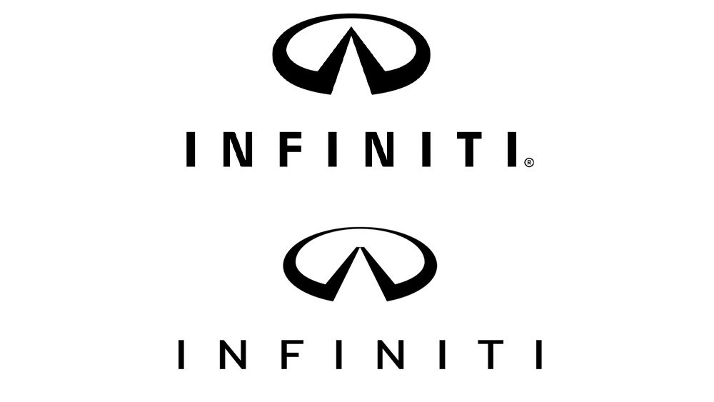
I try to be pretty open-minded about rebrands, because I don’t know what the brief was, but this one did make me chuckle. It seems like a massive undertaking for some very subtle changes. The reasons they give are pretty funny, and they even have a brand sound and a BRAND SCENT!!!


It just clicked with me that the logo is supposed to be a road going off into the distance, to infinity. It’s a single vanishing point. Mind=blown.
Yeah, the original logo works pretty well, it’s the letter I, it’s a road to infinity, easy peezy. In the new mark, the road just looks arbitrarily cut off. Kids these days with their cut off roads grrr, get off my lawn!