- cross-posted to:
- fediverse@lemmy.world
- lemma@lemmy.world
- cross-posted to:
- fediverse@lemmy.world
- lemma@lemmy.world
Welcome to Lemma - Your New Favourite App!
I’m thrilled to introduce the very first public release of Lemma on TestFlight. Get ready to experience a whole new level of browsing the fediverse!
🌟 Key Features 🌟
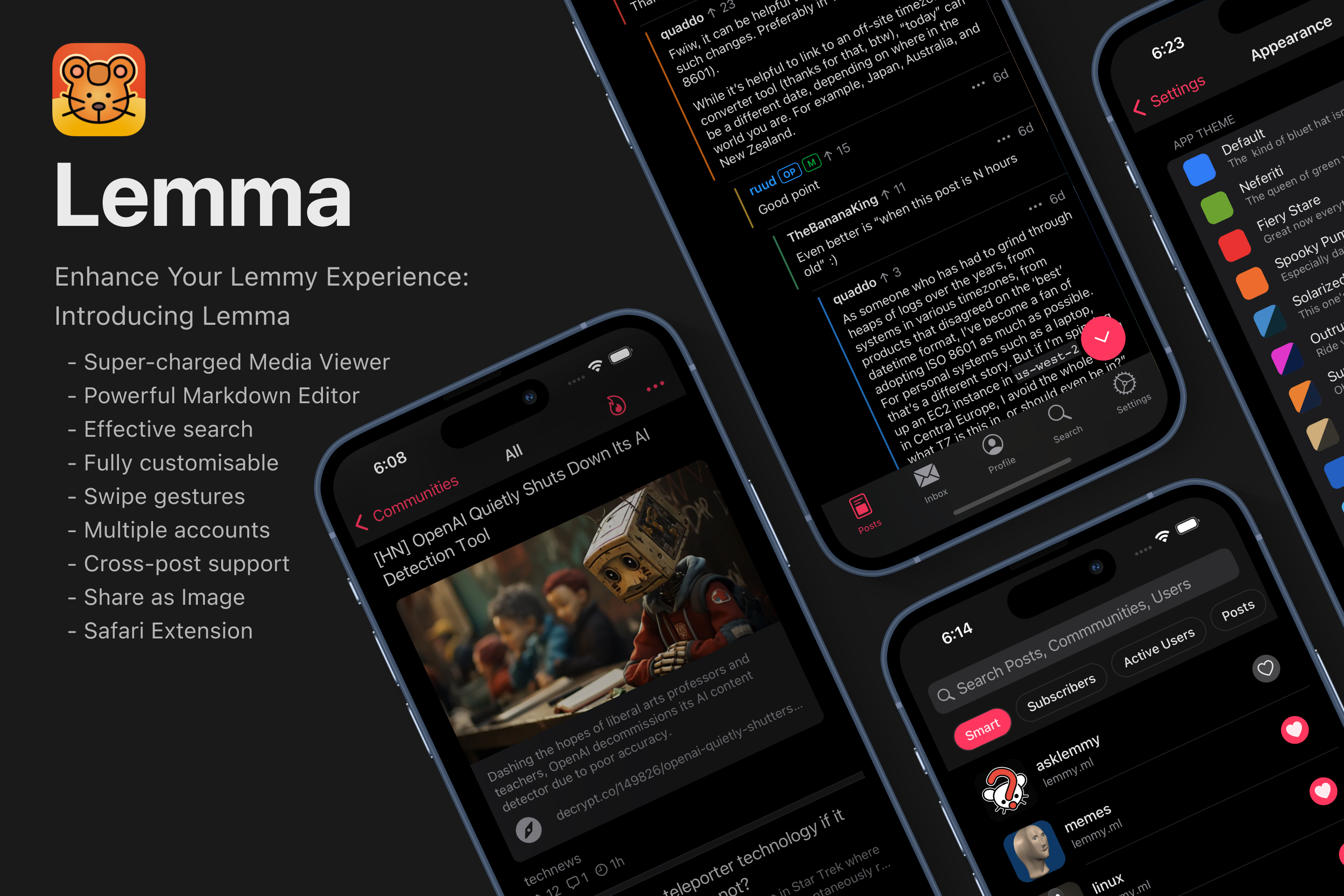
- Super-charged Media Viewer
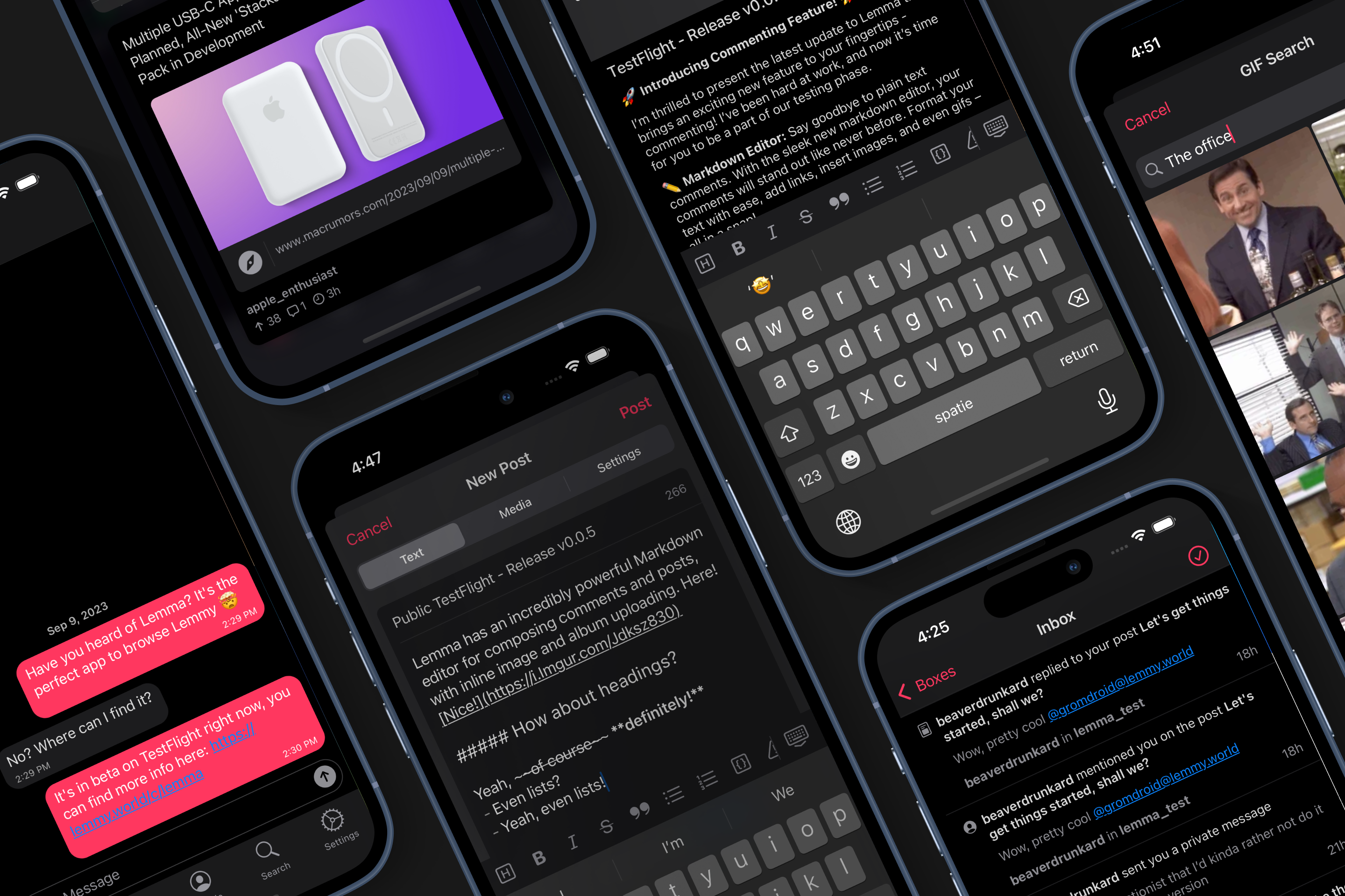
- Powerful Markdown Editor
- Effective Search
🔥 Why You’ll Love Lemma 🔥
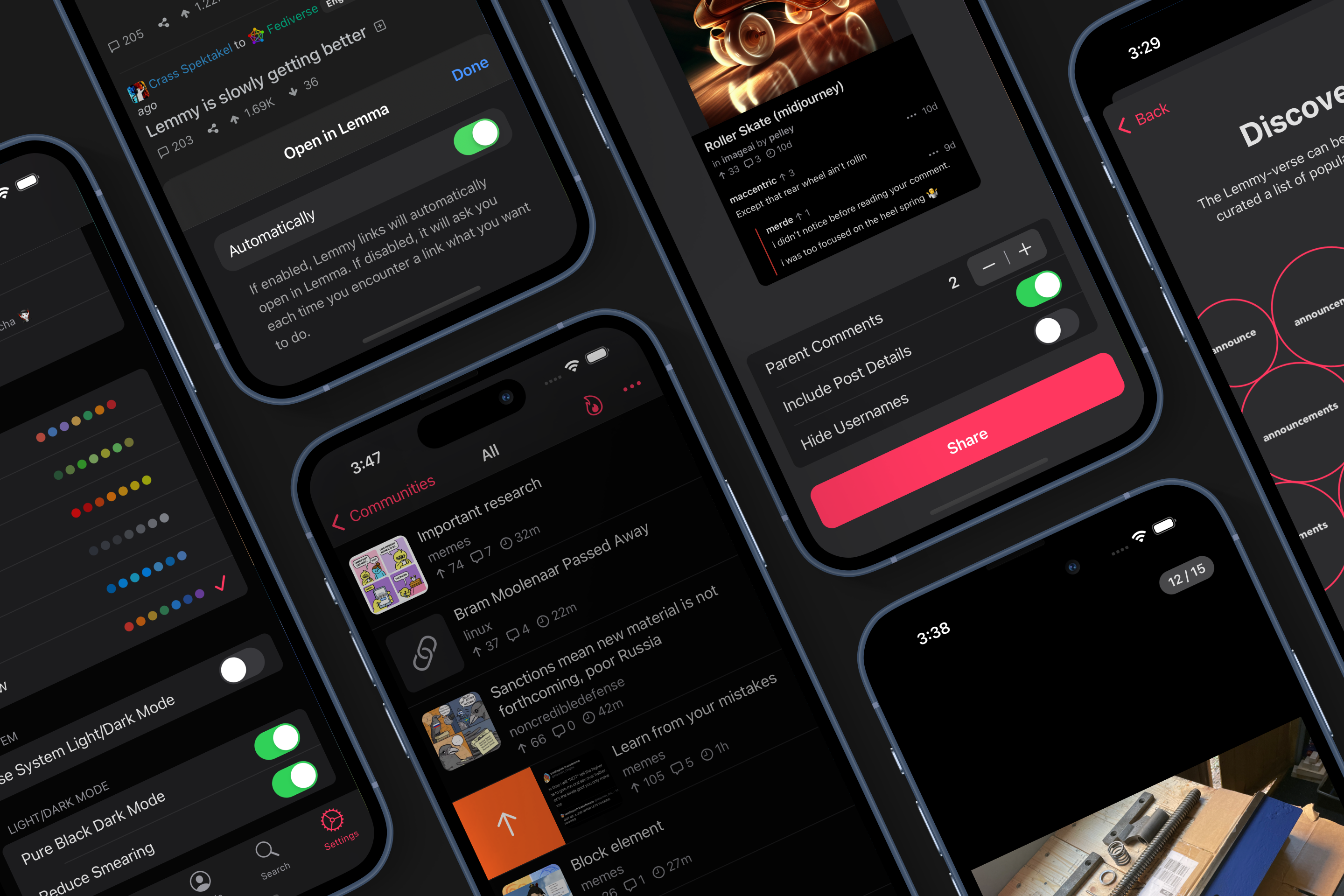
- Fully Customisable
- Swipe Gestures
- Multiple Accounts
- Cross-post Support
- Share as Image
- ‘Open in Lemma’ Safari Extension
- Private messaging
📣 Join The Community 📣
I would love to hear from you! Join our growing community of users to share your feedback, ideas, and suggestions. Together, we’ll make Lemma even better.
💡 How to Get Started 💡
- Download TestFlight from the App Store if you haven’t already.
- Follow this link to find Lemma in TestFlight.
- Tap the “Install” button to get early access to Lemma.
- Explore the app, try out its features, and let me know what you think.
🤝 Feedback & Support 🤝
Your feedback is invaluable to me. If you encounter any issues, have suggestions, or just want to say hello, please reach out to the Lemma community (!lemma@lemmy.world). Thank you for being a part of our journey. Together, we’ll shape the future of Lemma. Get ready to experience something amazing!
🍺 Buy Me a Beer 🍺
I’m building Lemma as a side project in my free time. If you’re enjoying Lemma and would like to say an extra thank you, you can buy me a beer ❤️
📌 Note: This is a TestFlight release, so your feedback will help me fine-tune the app for its official launch.


so excited for this one. loving it already; the onboarding is beautiful with the suggested communities. curious if you will add swipe to go forward at some point?
I would absolutely love to implement swipe to go forward, it was one of my favorite features. I’ve tried to search how one would implement that, but so far I haven’t found anything useful sadly :(
If an iOS developer reads this and has suggestions on how this could be implemented, I would love to have a chat!
Just curious, what are you building this with? SwiftUI/UIKit or something entirely different?
It is written in React Native, with some self made Swift modules here and there. I wrote some background info in a previous post if you’re interested (:
That’s actually pretty impressive, I had the feeling it wasn’t swiftUI or UIKit due to kinds of bugs that I’ve come across, but the general feel and look is perfect. Really well done :) Not sure if you’ve answered this somewhere before (if so I couldn’t find it), have you considered making it open source? I know there are advantages and disadvantages to both so I understand the decision either way.
This app has the best gui out of all the lemmy apps I’ve tried. It is the closest to Apollo in terms of design and detail. Kudos.
Been a very happy voyager user for a minute, this might be the first contender to dethrone! Awesome work, show me some cute app icon options!!
I’ve always gone back to voyager sooner or later so far, but I like lemma a lot and it’s probably gonna be my main app sooner or later. It’s mainly bugs that keep me from using it currently. But it’s already gotten a lot better :)
So far I’ve been going back and forth between Voyager and Avelon. Will definitely be keeping an eye on this one too.
Swipe Gestures
Does this include “swipe between posts”?
This has the best gif/video viewer of the Lemmy apps I’ve tested. I like compact mode, and being able to open the video with one tap, and have it in the native viewer with sliding fast forward & reverse is awesome! Great work!
One small tip/bug… after switching accounts, you it doesn’t appear to be reloading the Home feed for the new user. So I see the Home list of posts of the user I just switched away from.
I’d love to see the implementation of icon choices. This is a truly beautiful app but that icon is a hard sell.
Here’s some things I’ve been noticing (I’m on iOS 17, so might be related to that):
- the “jump to next comment” button is either stuck at the top (status bar) or inside the tab bar at the bottom
- the vote button doesn’t always count correctly (changes color but doesn’t count up)
- while typing a comment, the entire text sometimes flashes at the end of the textfield (Here‘s a video demo)
- if the tab bar scrolls away inside the inbox and I go back to the inbox overview, there’s no way to go somewhere else
i’m seeing the ‘jump to next comment’ button stuck in the top status bar area as well on iOS 16.6
Wow! The first impression: Welcome to the Fediverse, Apollo!
This is such a beauty! 😊
Very interesting. Will keep this along together with Avelon. Can you tell a bit more about how it’s been written? Swift or React Native etc.? Thank you for the public beta.
It’s written in React Native, with some Swift modules here and there. I wrote down some more in depth behind the scenes in a previous post.
Non-bug feedback:
- It‘d be great to have posts + comments visible in a combined list in the profile tab (beneath the post/comment/… list)
- just personal preference, but I’d love to have the tab symbols be a bit thicker and maybe slightly different symbols (example) as I find it looks a bit more modern, but again…just personal preference.
- scroll up when tapping on tab bar icon (currently goes back straight away)
- automatically jump into the “inbox” inside inbox or show a few of these on the main screen. I‘m always tapping twice to get there


