
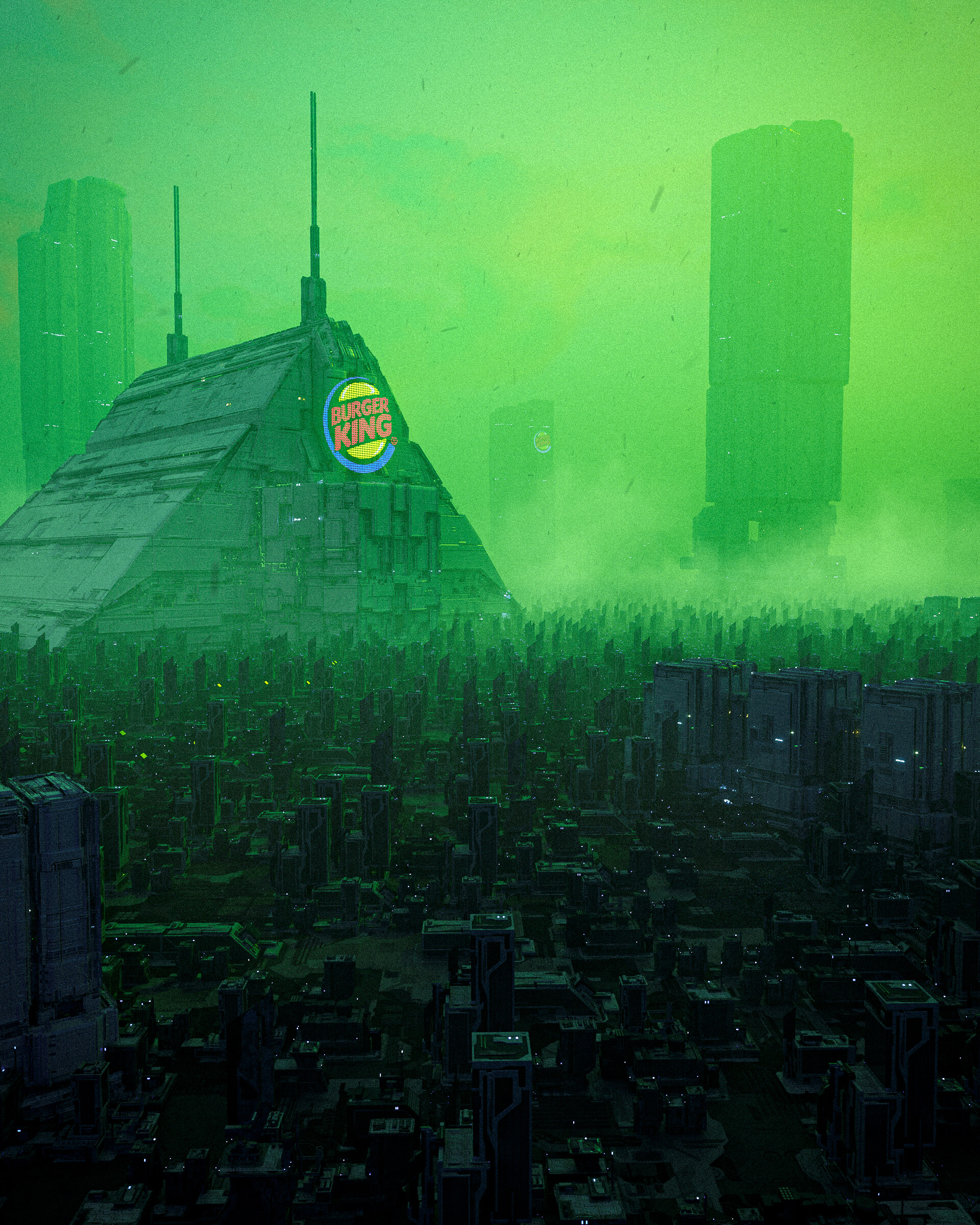
Source: Burger King In 400 Years (by Liam Pannier - ArtStation)
ArtStation profile: https://www.artstation.com/liampannier
RSS Feed: https://liampannier.artstation.com/rss
But in 400 years every restaurant will be Taco Bell
please
That’s a lot of copy pasted buildings, sheesh
unrealistic
Burger King has changed their logo 6 times since they were established around 70 years ago. So we can assume they would change the logo at least 10 more times within the next 400 years. Maybe they would change the shape fitting to the building they’re using right now, maybe it’s more cartoonish, more neon (to contrast the relatively dead-looking environment), maybe it’s even a hologram you only see when you look at the building
in other words: Common mistake to presume something in the future will look exactly like the stuff we know today. To bust your bubble: Take a look at the first Coca Cola tin and compare it with the one’s we’ve got today. Now you see the difference
reminds me of Costco…
🤣🤣🤣
Budget blade runner meets disappointing demolition man.
If eighties and nineties movies are trumping you in immersion, you should be doing something else

