
For the last 10-15 years I’ve been trying to branch out my BD and Euro comics reading, yet I regularly seem to be reminded (to the point of bafflement) how much *more* excellent content there always is to discover.
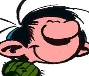
Take the cover pic above from the premier album of Carmen Cru, by Jean-Marc Lelong. I randomly bumped in to it looking through a defunct, BD tumbler acct, and immediately thought it absolutely delicious, and even kind of Halloween (or orc?)-themed. The series first appeared in Fluide glacial magazine in 1981, and later came out in album form (8 total).
Altho I’m just getting in to this series, I already love the excellent ink-work. Even better, the title character is just hilarious, and the stories, highly amusing. Here’s the very first two pages published, from the short story The Scammers:

In which Carmen wants to make a bank deposit, tries to strong-arm her way to the front of the line, and is told she must start at the back (like everyone else).

So she duly heads to the back… then goes right back to the front of the line, this time on the other side! Assured again that she must wait her turn, she walks over to the bank manager’s office and interrupts things, once again asking to make a deposit(!)
Told that she needs to see the teller for that, she complains that she already tried but was refused service, and even insulted. Hearing that, the bank manager reluctantly begins to appease her. [the story concludes with Carmen winding up making a fool and petty servant of the manager, incidentally ruining the client’s morning]
To give a little background on her, Carmen is essentially a deranged, misanthropic old recluse who’s also a master of bending people to her will. I sense that she’s also designed to be a certain commentary upon French provincials from an earlier age. This isn’t the first time I’ve seen this sort of formula at work, but I’m really impressed so far with the skill which in which Lelong carries it all off.
The French WP page gives further background in amusing style, and is translated here.
What a funny character. She must be the most grumpy old lady in the world :D I like the drawing with the cycle because often cycles are drawn in far from technically correct ways. In this case though, you can tell the artist actually had looked at a bike before. Everything except a few parts is pictured correctly and in detail. Even the adjustable race plus the lock nut of the headset and the butterfly nuts on the hubs have been drawn. The omission of spokes, brakes and cables makes sense because they are cumbersome to draw and not that relevant. The result is a really good balance between technical correctness and drawing effort in my opinion.
Wow, what an eye for detail. oO Are you a biker, mein herr?
Interesting you point out the omissions, as it brings us to a certain classic principle in art, as in-- how much detail to go for vs. how much to omit? Personally I tend to be a fan of ‘less is more,’ while at the same time trying to persuade the viewer that ‘it feels like all the necessary detail is still there.’
There’s also the situation of too much detail potentially weighing an image down, making it feel too ‘busy’ compared to the rest of the piece. For example, it’s possible that adding the brake cables and spokes would have unbalanced the image, bringing attention to the figure of the
old gargoyleMadam Cru, who might look under-detailed in that case. Just a theory, anyway. You know I’m always up for talking about art. ^^120% Biker (never had a car) and also a trained bike mechanic (3,5 years, regular german apprenticeship)
Exactly what I was thinking about. I first noticed it on a sculpture close to my place called “Die Postliesl / Briefträgerin” by Frauke Wehberg. The artist created a sculpture that is amazingly close to reality overall but omitted the spokes and some precision mechanics, probably because it´s problematic to create such fine structures when casting bronze (not sure if it´s bronze, might be copper or brass too …)
That reminds me of how Moebius developed his style over time, from using lot´s of lines and details (like in Blueberry) to the masterful ligne claire style which he used later (like in The Incal, Aedena and most of his art that I post). Moebius once talked about how his old style made it easy to hide imperfections with that many lines and how he had to work much more disciplined and precisely when perfecting his ligne claire style because in ligne claire every mistake clearly shows.
Wow, nice! Say, do you happen to have any experience with e-bikes?
Hey, that’s cool. In fact I really love how the spokes aren’t represented at all. It adds such a hint of motion. Btw, do you know what the crate / block is meant to be, behind the bike?
You made me curious about the casting alloy, and I think you’re right about it being bronze, as per this source.
Fascinating. You know that all rings true to me. For example, altho I respect Blueberry perfectly well, it feels really heavy to me, as if carrying more detail than I feel comfortable with. Yes, I definitely prefer his lighter, more elegant style that he shifted towards.
This also reminds me of a concept not just in the arts, but as a sort of general principle, that-- on the path to being a ‘genius’ in a particular skillset, one first masters it fully so that one can then break its rules in all the best, most innovative ways.
There was no way to evade them while working in the business during the last years. Actually in my last job I did more E-bikes than Bicycles.
The piece is called “Briefträgerin” which translates as “The Mailwoman” and resembles a mail and package carrier working for the german postal service. Sorry I did not translate that in my earlier post, then it would have been obvious that those boxes are post packages.
Interesting, as a mechanic I can differentiate steel, aluminium and titanium easily but I lack any experience regarding bronze/brass/copper.
Both styles represent their own particular aesthetic with advantages and disadvantages. Imagine Blueberry would have been drawn in ligne claire, or imagine The Incal drawn in the “many lines” style of Blueberry. Even if the stories were exactly the same, they would look and feel like different universes compared to the way we know them.