

The way they talk about it makes it sound like they invented the written word, but that notwithstanding the fonts actually look really nice in my opinion.
The way they talk about it makes it sound like they invented the written word, but that notwithstanding the fonts actually look really nice in my opinion.
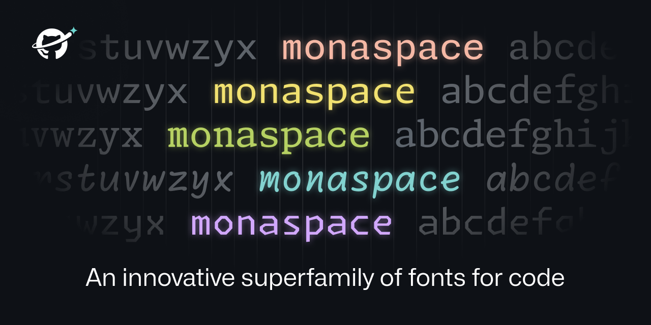
Very interesting technique to get the widths of the glyphs uniform without them looking ugly in most cases. OK, one can make it look bad if you know the “pain points” of the system, but in normal flowing texts, the fonts do look good.