Man these comments are fun. The patricians defending the (admittedly) bad UI/UX as the skill-hurdle it is, while the rest are finding inventive ways to rephrase “gib button plz”
While it may have begun that way (and may still be the overwhelming use case, idk the breakdown) devs are using it for FOSS releases, and that’s where the ‘less literate’ crowd enters. Sourceforge was very simple to use, and had a consistent layout. GitHub wasn’t meat to be a SF replacement, but here we are having this discussion
But it is often additionally used as a software package distribution platform, so it would be helpful for some developers to reach their users by having a clearer path to the most current release.
I can personally do without a special button, and the op is obviously making a joke, but why not improve the UX for some users? It’s certainly possible to do this without impacting the smelly nerds who wouldn’t use the button.
Plenty of developers also use GitHub for software distribution for end users, so that’s where the problems lie. I’m not saying GitHub should change their UI to match something the site wasn’t made for, but it’s still an issue for people who choose to use it that way.


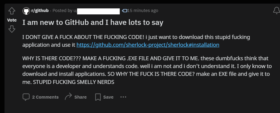
Man these comments are fun. The patricians defending the (admittedly) bad UI/UX as the skill-hurdle it is, while the rest are finding inventive ways to rephrase “gib button plz”
The UI is fine.
It’s just that Github is a code sharing and collaboration platform for developers, not a software package distribution platform for end users.
While it may have begun that way (and may still be the overwhelming use case, idk the breakdown) devs are using it for FOSS releases, and that’s where the ‘less literate’ crowd enters. Sourceforge was very simple to use, and had a consistent layout. GitHub wasn’t meat to be a SF replacement, but here we are having this discussion
But it is often additionally used as a software package distribution platform, so it would be helpful for some developers to reach their users by having a clearer path to the most current release.
I can personally do without a special button, and the op is obviously making a joke, but why not improve the UX for some users? It’s certainly possible to do this without impacting the smelly nerds who wouldn’t use the button.
Plenty of developers also use GitHub for software distribution for end users, so that’s where the problems lie. I’m not saying GitHub should change their UI to match something the site wasn’t made for, but it’s still an issue for people who choose to use it that way.