

It’s pretty easy to spot dark patterns when you look out for them, but I found a pretty obvious example of this.
Stoofie is a brand that sells water fountains for your pet (I don’t know what the problem with a water bowl is, but I digress). WayBack Machine
Plastered at the top of their website is “33% OFF Ends Today- Free Shipping” with no way to dismiss it. There is a scrolling text under the main image “FAST AND FREE SHIPPING 60-DAY FREE RETURNS”
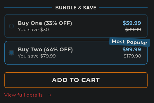
If you scroll down, you’re immediately introduced with a product with the option to buy two preselected. The rest of this section explains itself:
Other things are sprinkled in the main page, but it really is the prime example of dark patterns. I am personally sick of finding them, but would love to see more examples of what others have found. Please, share your favorite examples of dark patterns. Don’t forget to archive them first so they can never be lived down.
The presumption is that the brick and mortar store is not bad. Yes, they are bad too. Maybe just as bad, maybe not as bad, but they are no saints.
Options are limited for shopping, so we don’t have much choice. The reason I buy from Amazon is that essentially I didn’t want to shop at any local store any longer, they have bad polices AND they treat me like crap - not a valued customer.
Along came Amazon and I started buying from them. Then there was a big boo-hoo that ecommerce was killing their brick and mortar store sales. No sir, you were killing the sales but now I have somewhere else to go.
Amazon is horrible for many reasons, but pricing and customer service is not one of them. There’s a silver lining to that storm cloud.