
It’s suddenly rather cold, dark and rainy here after an unexpected run of ~80°F days. This panel from Blake & Mortimer’s La Marque Jaune (translated as The Yellow M) fits my mood pretty well.
Overall, I don’t feel like Jacobs is quite on Hergé’s level as a ligne claire artist, but every once in a while he charms me, as with this rainy panel that looks like it could be out of The Third Man (classic Orson Welles film from 1949, set in Vienna).
Funny, when I was looking for a higher-quality version of the original, I came across one with a much different color scheme. Hroom, now… which seems the better fit?

I’m still taking a posting break on the whole, but just wanted to add that I appreciate the group support from the other day. Clearly, a post per day was way too ambitious, but perhaps I can settle for a couple per week.
You must log in or register to comment.
I prefer the blue but it does read as later at night, the sepia could be interpreted as early evening darkness.
I too like the blue, especially with the pink text box!
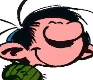
As someone who’s almost entirely ignorant about European comics, would it be fair to say that the ligne claire style is one of the predominant styles associated with the genre? My only prior experience with European comics is, predictably, Tintin.
I have to say that I find the style very appealing. It seems quite realistic even as it’s simultaneously very stylized. I don’t really have the language to describe my thoughts but in short, ligne claire art looks really cool and I’m keen to see more examples.
would it be fair to say that the ligne claire style is one of the predominant styles associated with the genre?
Yes, very much so. It started with Tintin, spread to many Franco-Belgian comics, then became popular around Europe as a whole. The WP article explains a lot, but I’d also like to add-- a big part of the reason Hergé switched to the LC style was evidently to make his cartoons show up more clearly based on the mediocre-quality print technology of the day.
Yes, and I share your enjoyment of LC. It shares some features with artistic reductionism, which I’m a big fan of. The idea that art doesn’t have to strive to be photo-realistic, but can instead be better for going in the opposite direction.
a big part of the reason Hergé switched to the LC style was evidently to make his cartoons show up more clearly based on the mediocre-quality print technology of the day.
Yes, I think I was picking up on that aspect, the silhouettes are very easily and clearly recognizable. I also enjoy art that is more stylized and less focused on being photo-realistic.
