
Are these menus important for you. I would probably be fine with a simple menu like in Nier Automata, netherless i like to see stylish one.
UIs in Hashino’s games have been avant-garde for a while now, but Persona 5 was the first time I thought the over-the-top design was essential to the game. Persona 5 makes for an amazing case study in top-down game design, where every last piece of it feeds back into the concept of a bunch of idealistic little shits running around causing upheaval in crusty old power structures by way of thievery. The menus were a big part of the constant reinforcement of this theme.
After playing the demo, I’m not sure how to feel about the menus in Metaphor just yet. I feel like a lot of it relates to things I haven’t seen yet in the game, though the use of the MC’s body–the artwork is literally him from head to toe as you proceed down the menu–is interesting. Leonardo’s Vitruvian Man is referenced in multiple spots in the game, and there’s also some body horror stuff going on with some of the enemies, so I imagine the sense of one’s human (humanoid?) body is important somehow. It feels a little bit form-over-function overall, but given the game’s pedigree, I’m giving them a lot of latitude once I delve into the game this weekend.
He’s not wrong; making nicely styled anything in UI is a PITA.
with a simple menu like in Nier Automata
If you go and break down all the little things it does, it’s actually not that simple. It’s not quite as in-your-face as P5’s menus were, but there’s a bunch of little transition effects – things like the triangle dissolve when opening it and a particular typewriter text effect that types out characters with deliberately wrong letters before correcting itself. Areas changing color like progress bars – which can be interrupted and which reverse themselves nicely if the user changes tabs so that you get a transition effect without delaying the user much. An overall styling that’s reminiscent of old LCD screens – which needs to work cohesively with the rest of the game design. Subtle changes to the music when the menu is open. Special animation sequences (e.g. in ending E). Etc, etc. Individually none of them is all that hard, but putting it all together was probably still a PITA for whoever wrote it.
Even Todd Howard admitted he uses UI mods for Skyrim. Menus are important, doubly so for jrpgs.
Yeah, but I’ll take a stylized menu over a glorified spreadsheet any day
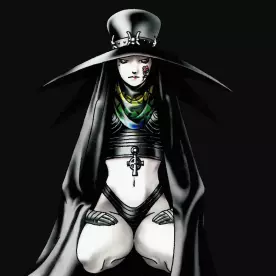
I have seen this game and I think the menus are terrible and the stylizing hurts visual clarity. There’s has the be a middle ground where you can stylize and make creative menus without making it look like this.
I really don’t give much thought about menus unless they are super over stylized to the point where they become unreadable or unnavigable. A basic, simple menu is preferable to me.
So many live service games have absolutely awful menus. They force ads in popups, they are confusingly laid out, and a decent handful of them don’t even have quit buttons, forcing you to alt-F4 to close it.
The current game I have issues with the menus is Dragon’s Dogma 2. There are like 3 different map menus, and the controls change between all 3 of them. It’s ridiculous.
I’m sure there’s some nuance being lost in translation here. In any case, yeah, it’s important, especially for a JRPG, where most of what you do is engage with menus. It’s not just the visuals, though. Metaphor’s combat menus are fantastic, they let you blaze through turns without making mistakes or having to think about the inputs too hard. It’s really nice. Worth the effort, if you ask me.